UAZ Logo and symbol, meaning, history, PNG
- Meaning and history UAZ is the car brand, which was established in very hard and full of tragic times of World War II, and the first vehicles of the company were meant to be used by soldiers of the Russian army.
- 1950 – 1954 The very first badge for UAZ looked very delicate and modest.
- Placed on the grille of the brand’s cars, it was a simple metallic “tick”, resembling an abstract geometric bird, or a letter “V” with sharp ends of the lines.
- The bottom part of the symbol featured a flat and lightly widened line, which added stability and confidence to the overall look of the badge.
- In this case, the “V” resembled a true symbol of the “Victory”.
- 1954 – 1957 The redesign of 1954 introduced a completely different ambler — with the circular central part and two geometric and straight wings coming out of it to the sides can the new colorful badge looked friendly and dynamic.
- The circular part of the UAZ logo featured an intense red background with a blue horizontal banner coming through its middle point.
- 1957 – 1959 In 1957 – 1959 the brand was using three different badges for its cars.
- One was a light blue and silver circular badge in a thick frame and with two silver horizontal lines under the strict white wordmark.
- The emblem was executed in sky-blue and featured an extra-thick silver outline, repeating the contours of the inner part.
- The silver wordmark was written in Russian inside the badge, looking confident yet fine.
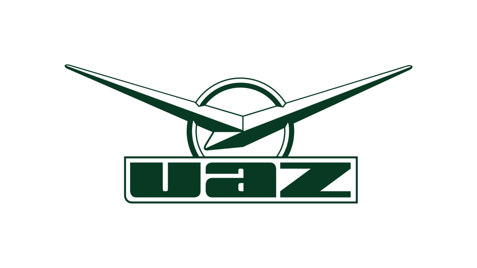
- 1962 – 2000 The badge we all can see today was created for UAZ in 1962, basing the original version of the brand’s emblem, the “V”.
- 1970 Along with a slightly refined emblem from 1962, the brand starts using another badge in 1970.
- The bird looked very similar to the iconic UAZ “V” but had the end of its wings softened and slightly bent, which added some tenderness and made the badge look friendly, and the brand — reliable and loyal.
- 2000 – 2016 In 2000 the brand starts using its “V” on a circle placed above a massive outlines inscription in Latin letters.
- This emblem is still used on some of the UAZ models, and is the only one, with the company’s name written not in Russian.
- This time the symbol was placed over a green wordmark in Russian, executed in a heavy sans-serif typeface, which looks brutal and stable.
- Font and color There are two different versions of the UAZ visual identity, used by the brand Today.
- The typeface from this version looks very masculine and even brutal.
- The green and metallic color palette of the UAZ visual identity represents the strength and seriousness of the brand, elevating the look of the emblem and Addis a touch of professionalism and responsibility.


Leave a Review