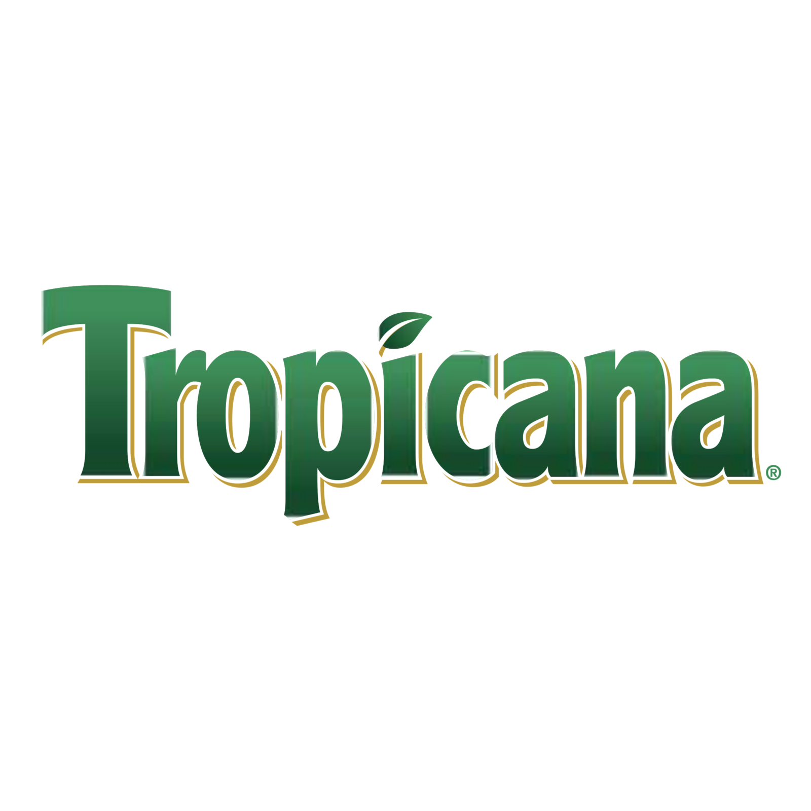
Tropicana logo and symbol, meaning, history, PNG
- Download PNG Tropicana Logo PNG Tropicana is an American brand of juices and fruit beverages manufacturer, owned by PepsiCo.
- The brand was established in 1947 and acquired by the world’s most famous drinks corporation in 1998.
- The first Tropicana logo was composed of a wordmark with a tagline placed on a curved ribbon under the nameplate.
- Throughout the years, the color of the Tropicana logo was changed to green, then orange, and in 1998 it became green again.
- Under the wordmark there was a white waved ribbon in a green outline, where the “Pure Premium” tagline in the uppercase of a traditional serif font was written in green.
- 1992 — 1998 The redesign of 1992 removed the ribbon with the tagline from the brand’s visual identity and switched the color of the logotype to orange.
- The dot above the lowercase “I” was replaced by a stylized green leaf, which showed the natural concept of Tropicana juices and made the palette more dynamic.
- The lettering kept its typeface but changed the color to green, and the white ribbon from the original emblem was colored green and placed under the main inscription, with the “Pure Premium” tagline in white, written in a sleek and bold serif typeface.
- The letters of the main logo part were shadowed and outlined in white and green.
- 2003 — 2007 In 2003 the ribbon gets removed again, and the main logo is being refined and modernized.
- 2007 — 2017 The logotype was arched and underlined with a thin gold line in 2007.
- Gold was now not only in the underline, but it was a color of the letters’ contours, along with white.
- The leaf above the “I” was redrawn and now gained a thick gold line in its middle.
- Minimalist and laconic, this Tropicana logo is still in use by the brand.
- This version only stayed with the brand for a few months, being replaced with a more traditional logo.
- 2017 — Today In 2017 Tropicana brings back its logo, created in 2003, but changed its color palette to plain muted orange, which looks very natural and warm.
- There is also a green leaf above the letter “I”, which first appeared on the logo version from 1992.
- Font and color The Tropicana logotype hasn’t changed much since the very first version creating in the 1980s.
- The Tropicana typeface is something in between Kandira Extra Black and Linotype Spitz Pro black, but, of course, with lines modified.
- This color combination looks very friendly and evokes a sense of reliability and trustworthiness.


Leave a Review