Trabzonspor logo and symbol, meaning, history, PNG
- Download PNG Trabzonspor Logo PNG Trabzonspor is the name of one of the most famous Turkish football clubs which was established in 1967.
- The club, nicknamed “Black Sea Storm” (which is “Karadeniz Firtinasi” in Turkish) is managed by Ahmet Agaoglu and has Eddie Newton as the head coach.
- The logo, used by the team today, was created in the very beginning of its existence, and only slightly modified throughout the years.
- The very first badge’s for the Turkish FC were composed of oval medallions in white or burgundy, with stylized letters “T” and “S”, drawn usually in blue or burgundy, or both.
- The letters were bold and smooth, with their tails and lines curved, looking like two rivers.
- Then the two letters monogram turned into a one flowing symbol, drawn in blue and placed on a burgundy background.
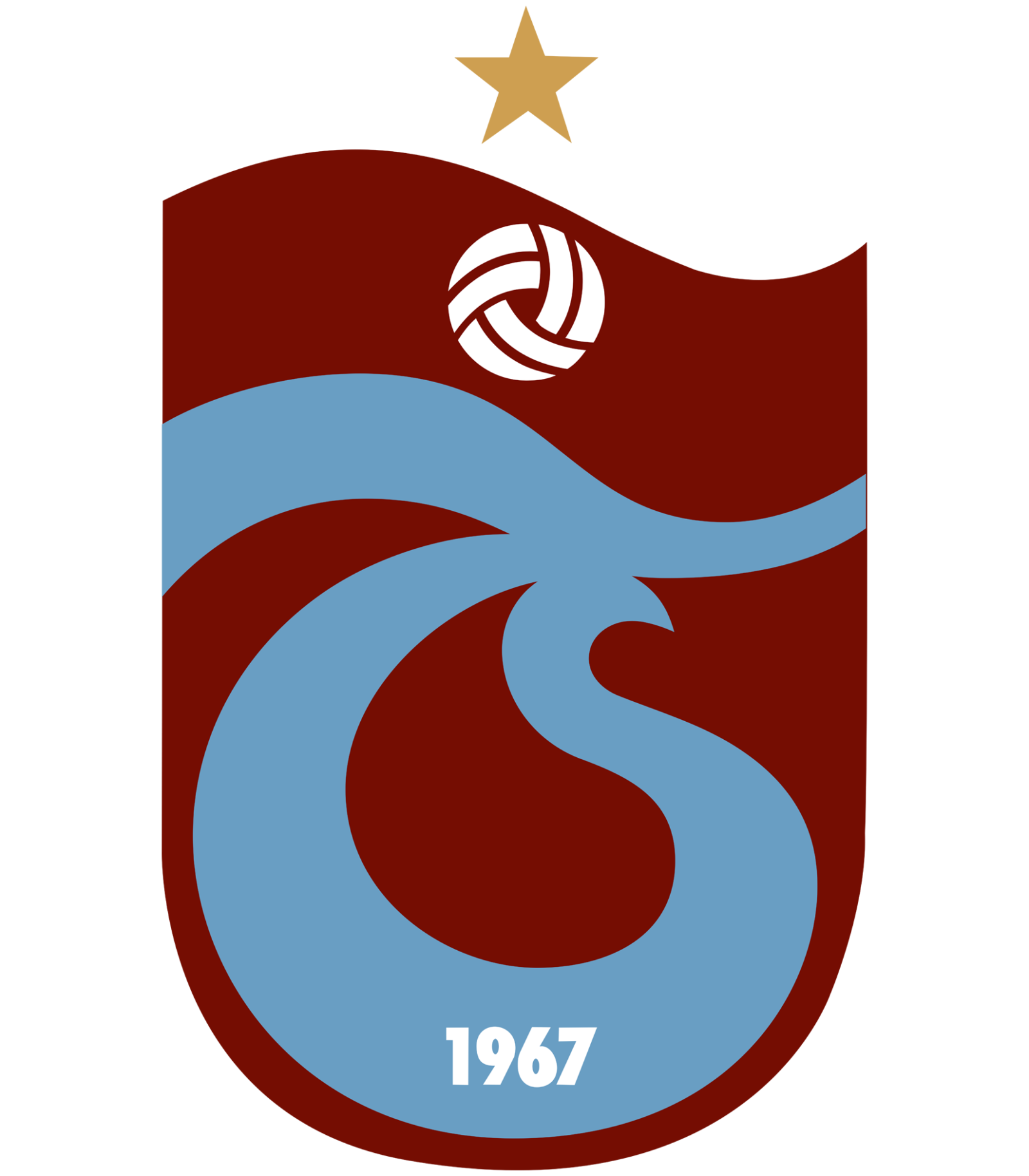
- The Trabzonspor logo we all know today features a burgundy shield with a white top, separated by a curvy line.
- The yellow star is the only element, placed on the white part of the logo.
- The main body of the shield contains the iconic blue “TS” symbol, featuring the white “1967” inscription in the bottom.
- Above the sign, there is a stylized white football with burgundy elements placed as a celebration of sports.
- The Trabzonspor logo is unique and instantly recognizable not only due to the use of a very sophisticated football color palette but also because of its smooth floating lines and contours.
- It is an example of timeless elegance, which will always be actual and will always make the team stand out.
- The blue “river” letters of the logo represent the stability and reliability of the club, while the white “sky” stands for loyalty and transparency.
- A perfect combination.


Leave a Review