Tostitos logo and symbol, meaning, history, PNG
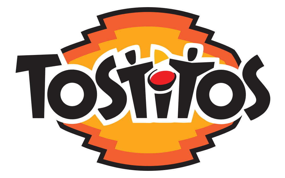
- Download PNG Tostitos Logo PNG Since its debut in 1979, the Tostitos logo has gone the way from a rather generic wordmark to an inviting emblem with a secret symbolism.
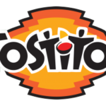
- 1985 — 2003 The logo, introduced in 1985, featured a new typeface, though the color palette and composition remained the same — black lettering with a red dot.
- The new font was sans-serif and had both letters “S” slightly enlarged and stretched vertically.
- The red dot above the “I” was now complemented by a yellow triangle, so the icon started looking like the chips and the sauce.
- The black inscription was set in one straight line, with all the letters slightly inclined to different sides.
- The stylized letters “T” have their bars a bit diagonal, so that it looks like people are stretching their hands to get the chips.
- The 2003 symbol This wordmark was a breakthrough.
- It was the first time that the logo acquired hidden symbolism.
- The “t’s” in the middle resembled people sharing a tortilla chip, while the dot above the “i” was a bowl of salsa.
- The highlight of the previous emblem, the people with a tortilla chip between them, is still present in the current version, although in a slightly updated design.
- Moreover, one more hidden meaning has emerged here, in addition to the one mentioned above.
- Now, this part of the logo resembles a cute smiling muzzle of a raccoon.
- Font In addition to the unique look, the custom type featured in the Tostitos logo has a hidden symbolism.
- Color The main colors are black, red, and yellow, while white serves as the background.






Leave a Review