Torino logo and symbol, meaning, history, PNG
- Download PNG Torino logo PNG Italian football club Torino was founded in Turin, Piedmont, in 1906.
- Initially, it was called Foot-Ball Club Torino.
- Meaning and history The meaning of the Torino FC logo is deeply rooted in the symbolism of the club’s home city, Turin.
- The Italian word for “Turin” is “Torino,” while the city’s emblem features a rampant bull.
- 1936 — 1946 The Torino FC badge, created in 1936, featured a traditional heraldic composition in dark red and white, with additional elements in gold, black and light blue.
- The right part of the crest contained a thin geometric “TAC” monogram with tall narrowed letters in a stylized serif typeface overlapping each other, executed in burgundy.
- 1959 — 1977 The redesign of 1959 kept the idea and composition of the previous badge, but redrawn all elements and switched the shape of the logo from crest to a vertical oval.
- The golden frame became thicker, and the contours of all elements were now outlined in thin black.
- The monogram was replaced by a full “AC Torino” inscription in all capitals of a bold and narrowed sans-serif tour face, with each of the golden letters outlined in black.
- In 1977 the Torino logo was redesigned again, with the bull and the crown redrawn using more blue shades and less golden ones.
- 19.. — 1983 Another version of the logo, created for the Italian football club, featured its traditional two-colored vertical oval enclosed into an interesting triple frame in orange and white with the clean and simple orange line from the inside, a rope-like orange from the outside, and white between them.
- The long vertical inscription was replaced by two intertwined “TC” letters in a classy and simple serif typeface, in a dark burgundy shade.
- As for the left part of the badge, it still boasted a crest with a bull and a crown drew on it, but now golden elements were switched to orange, which made them look sharper and more powerful.
- 1983 — 1990 The Torino logo of the 1980s featured the bull with the words “Torino Calcio” (both placed in a square frame) 1990 — 2005 In 1990 the badge from the 1980s comes back to the Torino FC visual identity, but being refined and modernized.
- The “TC” intertwined monogram was enlarged and started being the element that is equally important for the composition as the bull crest with the crown.
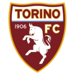
- 2005 — Today The redesign of 2005 introduced a completely different Torino crest, which still keeps the main elements of all the previous badges.
- It is a maroon shield in a yellow outline, with the upper part in white, featuring an uppercase “Torino” inscription in a bold modern typeface.
- The body of the crest had a stylized white image of a bull on it, complemented by the white “1906” datemark on the left, and white in a yellow outline ExtraBold “FC” lettering on the right.
- Colors The logo is dominated by maroon.
- Yellow, blue, and white are used as accent colors.




Leave a Review