Toblerone logo and symbol, meaning, history, PNG
- Download PNG Toblerone Logo PNG Toblerone is not the name of a company.
- It is a chocolate bar produced in Switzerland, and its logo history is interesting.
- Meaning and history The logo history dates back to 1908.
- They developed a unique mixture of milk chocolate, almonds, nougat and honey and their distinctive Toblerone chocolate logo.
- The name of the bar is a blend word formed from the parts of “Tobler” and “Torrone” which in Italian means honey and almond nougat.
- Now the Swiss brand including its Toblerone logo is owned by Mondelēz International Inc., a confectionery company from the USA.
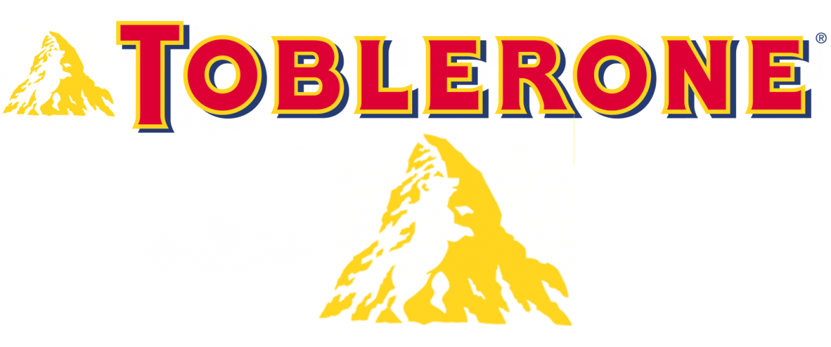
- The logo consists of a picture of a mountain that echoes the shape of the chocolate bar and the word “Toblerone”.
- The mountain is believed to be the Matterhorn which is in the Swiss Alps.
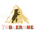
- When people buy a Toblerone bar and see the mountain icon on the packaging, they are unlikely to have a good look at it.
- Tobler incorporated it in the logo because Bern, the Swiss capital where the bar was created, is called the “City of Bears” and its symbol is a bear featured on the coat of arms of the city.
- Evidently, the Toblerone logo meaning pays tribute to the birthplace of the popular nutty treat.
- It is enough to spot it once, and then you always see it.
- Colors and Font The color palette of the Toblerone chocolate logo is made up of gold (pantone 873 C), white, red (pantone 485 C) and blue (pantone 2758 C).
- The typeface for the lettering “Toblerone” is Meta Plus Bold Caps in red with a gold and blue outline.




Leave a Review