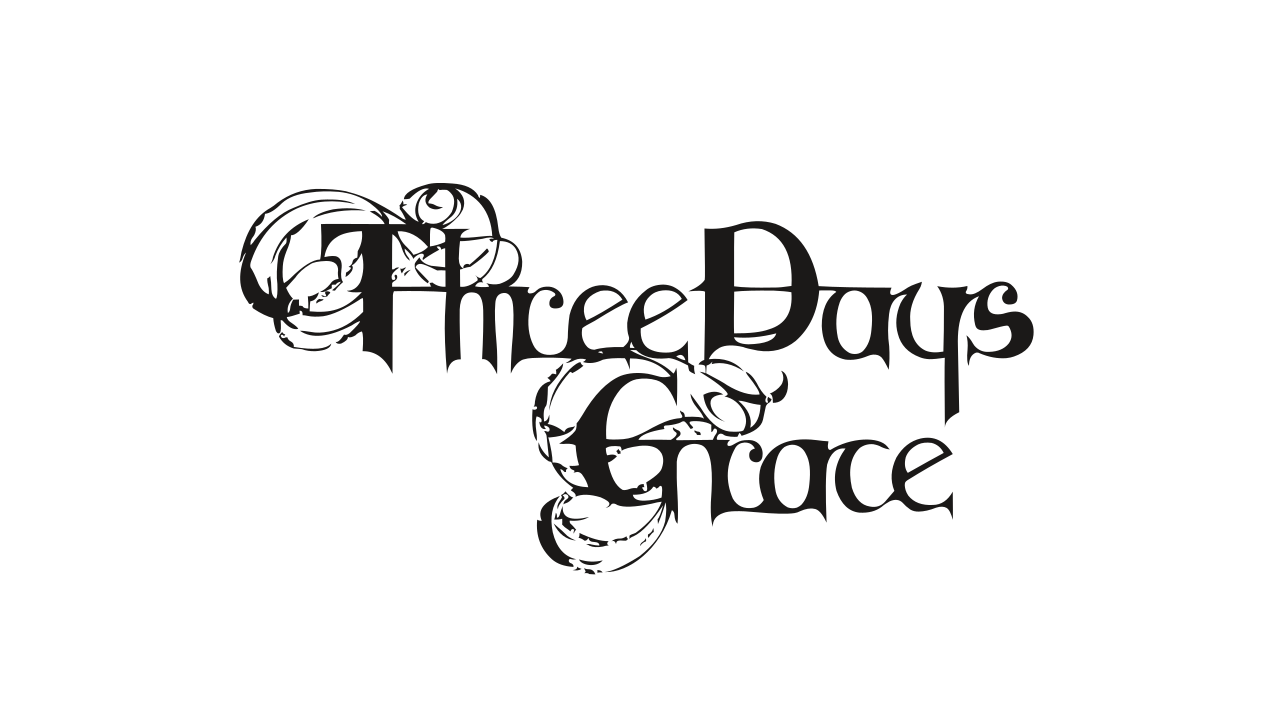
Three Days Grace Logo
- Download PNG Three Days Grace Logo PNG Three Days Grace is the name of a rock band from Norwood, Canada.
- It works in the genre of alternative metal and post grange.
- Already in 2003, the group released its self-titled album “Three Days Grace” which was such a success that received the platinum status.
- The band became a significant event in the musical life of Canada and repeatedly occupied the first lines of hits lists.
- By now the musicians have sold six studio-recorded albums.
- Meaning and history 2003 The band’s first logo appeared in 2003 on the cover of their first self-titled album.
- It represented simply the band’s name, written in a stylized font commonly used in horror movies titles.
- In the middle of the wordmark, there was an emblem.
- This thrilled twist was a tribute to the traditions of the heavy metal style incorporated in the band’s music in the early period.
- It’s about deciding what you could do if you had just three days left to make an important change in your life.
- 2006 In 2006, with the new album “One-X”, the logo was changed.
- The emblem circle disappeared and the wordmark got a new font very close to the commercial Crewekerne Magna Expanded Bold with a stronger flavour of magic and romanticism.
- It was a reflection of a new, more romantic style which dominated in several songs included in the album by Gontier.
- He had worked on these songs while being in a rehabilitation centre in which he had been treated for drug addiction.


Leave a Review