The Prodigy Logo
- It was founded in 1990 by Liam Howlett, who was also the author of the songs that made up their first mini-album released in 1991.
- Quite soon the musicians became popular at home and then abroad, first in Italy and some other countries.
- By now, the group has sold more than 25 million copies of its albums.
- The very first existed only from 1990 to 1991.
- The whole wordmark was written on a white outline of the badge and executed in an extended sans-serif typeface, with its uppercase letters massive and solid.
- 1991 In 1991 the new logotype was introduced by Prodigy.
- 1991 — 1996 Another logo created in 1991 featured the same style of lettering as on the previous badge, but with thicker lines and a double white and blue outline of each letter.
- The new logo featured bold white lettering on a black background, with the letter “O” enlarged and having a white image of the insect inside.
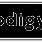
- The inscription was executed in the lowercase of a contoured sans-serif typeface.
- 1999 For just one year, in 1999, the band used another logo design — a black handwritten wordmark was placed in the right from a solid black circle with the white ant silhouette on it.
- This badge looked cool and very modern.
- 2004 — 2008 The logo from 2004 can be called the most minimalist in the Prodigy visual identity history.
- It was a bold sans-serif inscription where black uppercase letters were complemented by a delicate cursive “The” above the letter “P”.
- A completely new style and color palette were introduced by the band.
- A completely new style and color palette were introduced by the band.
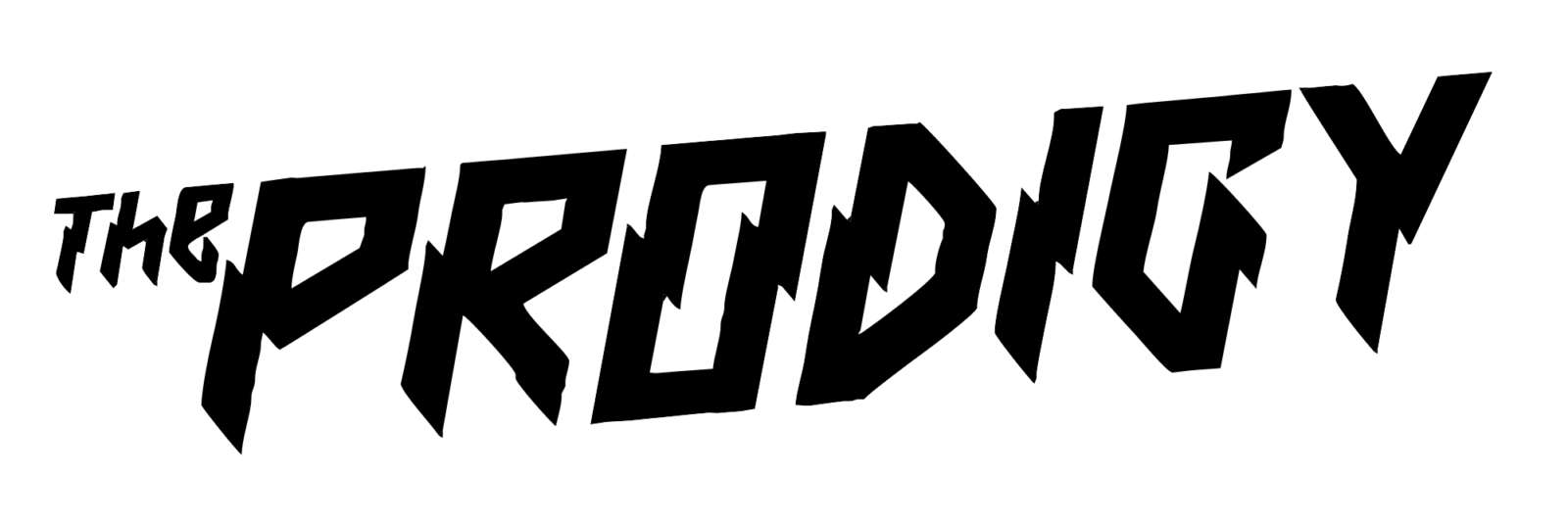
- 2009 — Today The logo we all can see today was introduced in 2009 and featured a black logotype placed on a white background.
- The custom typeface of the inscription featured straight geometric lines with sharp triangular ends and a very strong character.
- The logotype is set diagonally and has its “The” part written in small letters and placed on the left from the “P”.
- 2015 — Today 2017 In 2015 another version of the logo created in 2009 was introduced.
- It featured the same shapes and concept, shout the color palette was enlightened, adding more white to the ends of the letters.






Leave a Review