Texas Longhorns Logo
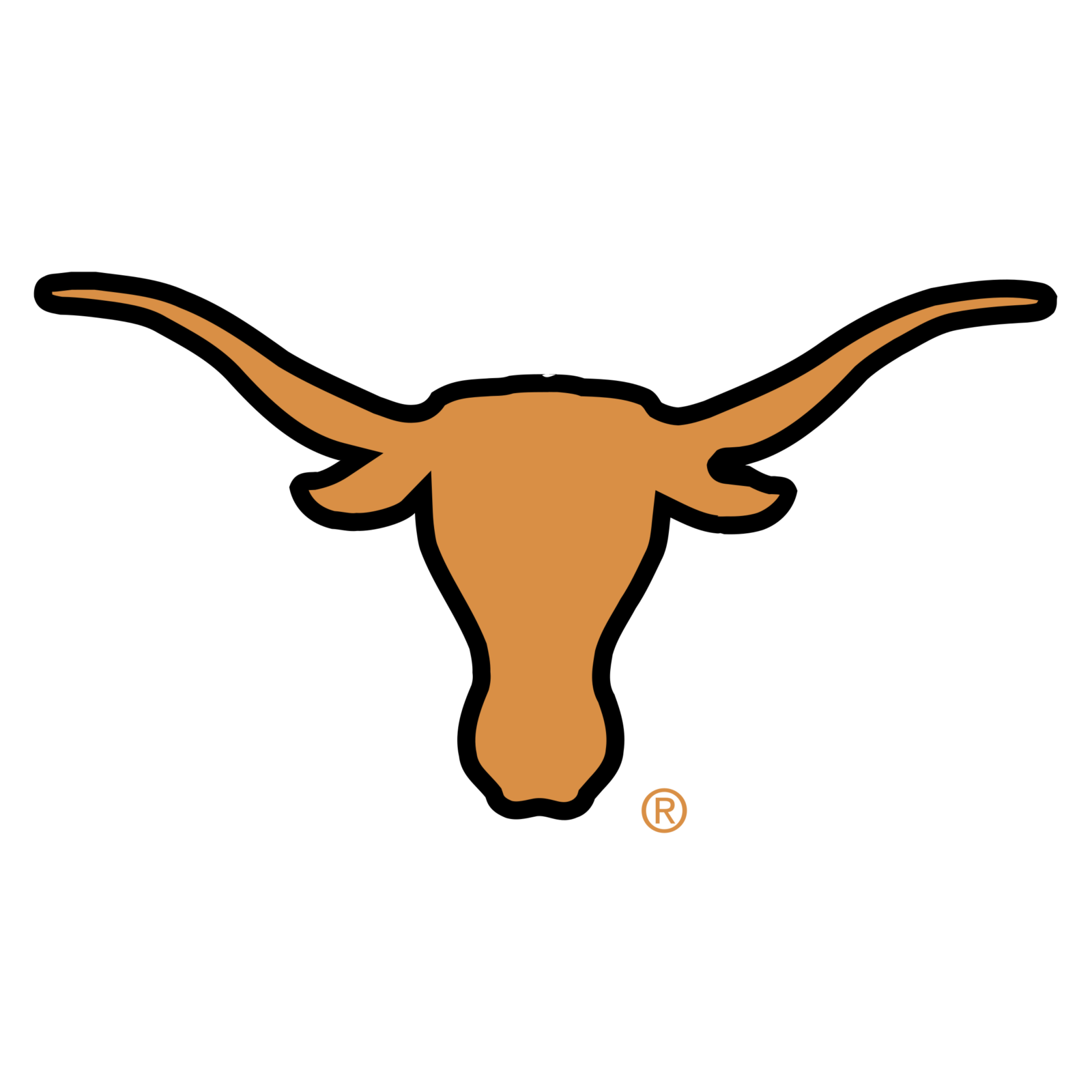
- Meaning and history The visual identity of Texas along horns has been surprisingly constant since the beginning of 1960 when its iconic “bull” logo was introduced.
- Though the official primary emblem hasn’t been changed since the day of its adoption, the team has had several redesigns and modifications of its secondary badges, which were all executed in the same color palette, but in different styles and with various moods.
- 1961 – Today The iconic Longhorns logo, introduced in 1961, boasts an orange silhouette of a Bull’s head with its horns elongated to the sides.
- The very first version featured a caricature of a Bull’s head with an orange hat jumping off its head.
- The animal was turned to the left and had its mouth opened, as it if was yelling at someone.
- The hat had a white bold letter “T” on it.
- 1977 – Today The funny cartoonish bull from the 1960s was redrawn in 1977 and still stayed among the logo version the team uses today.
- The bull on this version looks straight and wears a cool cowboy hat, with the letter “T” placed on its ribbon.
- The orange color on this emblem is a bit darker than on the previous one, which makes the animal look more brutal and serious.
- 2000 – Today The beginning of the 2000s became really productive for the team and brought three different versions of the Texas Longhorns alternate logos to the world.
- These are three different styles, executed in orange and white, and reflecting the essence and purpose of the football team from Austin.
- The first badge is based on the primary logo of the Longhorns, its sleek iconic bull.
- But here the bull is drawn pretty detailed in the black and white palette, with the arched orange inscription in a double monochrome outline, placed above the image.
- This logo was created as a more detailed version of the primary badge, revealing the character of the team and the main meaning of its philosophy and principles.
- As for the second alternate logo, created in 2000, it features a simple bold letter “T” executed in orange and placed on a white background.
- As for the third alternate logo, used by the team today, it is composed of two overlapping letters “T” and “U”, where “T” is placed a bit lower than “U”, and this makes the monogram look really interesting, resembling the silhouette of the Bull’s head or a kind of graal or a champions cup.
- Font and color There are two possible styles of the arched “Texas” inscription, used for the Longhorns’ visual identity.
- Its main version uses an extended serif typeface, which is very similar to such font as ITC Century Std Ultra.
- As for an alternate badge, with the outlined inscription, it uses a modern geometric typeface, which looks close to Campus MN and Princeton Std fonts, which are often used for the Colleges’ and Universities’ logos.
- As for the orange and white color palette of the Texas Longhorns emblem, is it bright and happy, and makes the logo memorable and instantly recognizable, along with reflecting the fighting spirit of the team and its energy in moving forward.










Leave a Review