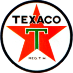
Texaco logo and symbol, meaning, history, PNG
- Download PNG Texaco Logo PNG Texaco is the USA petroleum company, which was established in 1901 in Texas and is a significant part of Chevron Corporation since 2001.
- The brand is widely known for its fuel stations, performing all over the globe.
- Meaning and history 1901 The original logo featured a red five-pointed star.
- While the design was iconic and impressive, it was also too impersonal.
- The fact it has been associated with communist ideology is not a positive connotation, too.
- In addition to the words “Made in Texas” that appeared over the star, the authors of the emblem added the smaller lettering “The Texas company” and a blue ring.
- 1909 The visual “rubbish” mostly disappeared from the design leaving only the red star and the stylized “T.” We should mention, though, the “T” was positioned in a slightly awkward way, with its top bar partly coinciding with the outline of the star.
- 1913 The “T” adopted more logical proportions.
- 1936 The lettering around the star disappeared leaving the emblem slightly cleaner and easier to grasp, although it still felt overloaded.
- 1963 The word “Texaco” in a simple sans became the centerpiece of the logo, while the star moved below.
- The “T” across it looked very much like a hammer.
- This only reinforced the communist connotation as it reminded the hammer and sickle, the Soviet emblem.
- 1999 The name of the company disappeared from the Texaco logo leaving only the star and the “T.” Font and color The bold and strict sans-serif logotype from the Texaco visual identity evokes a sense of power and stability, with its clean straight lines and distinct cuts.
- The typeface of the wordmark is very close to such modern yet simple fonts as TT Hoves Black and Genera Alt Heavy.


Leave a Review