Tennessee Titans logo and symbol, meaning, history, PNG
- So in 1997 they became the Tennessee Oilers and since 1999 the club has been known as Tennessee Titans.
- Meaning and history The Tennessee Titans logo history is inseparably connected with the history of the team.
- It also reflects the local peculiarities.
- On the whole, their collection of primary logos includes seven emblems.
- 1960 – 1961 When the Houston Oilers appeared on the football field for the first time, their emblem represented a man that looked like both a football player and a cowboy for he was wearing a cowboy hat and a uniform and holding a football.
- The color scheme included blue (the uniform) and gold (the hat and the boots).
- Later a few minor changes were made including an alteration in the color scheme.
- It was a silhouette of a football player’s helmet outlined with a thick black line and an oil derrick on the helmet.
- 1972 – 1979 In 1972 the oil derrick changed its color from black to red and got a blue boarder.
- 1980 – 1996 The Oilers’ logo introduced in 1980 looked very simple and at the same time symbolic ‒ just an oil derrick in blue with a red outline against the white background.
- 1997 – 1998 1999 – Today In 1999 the new nickname required an entirely new logo.
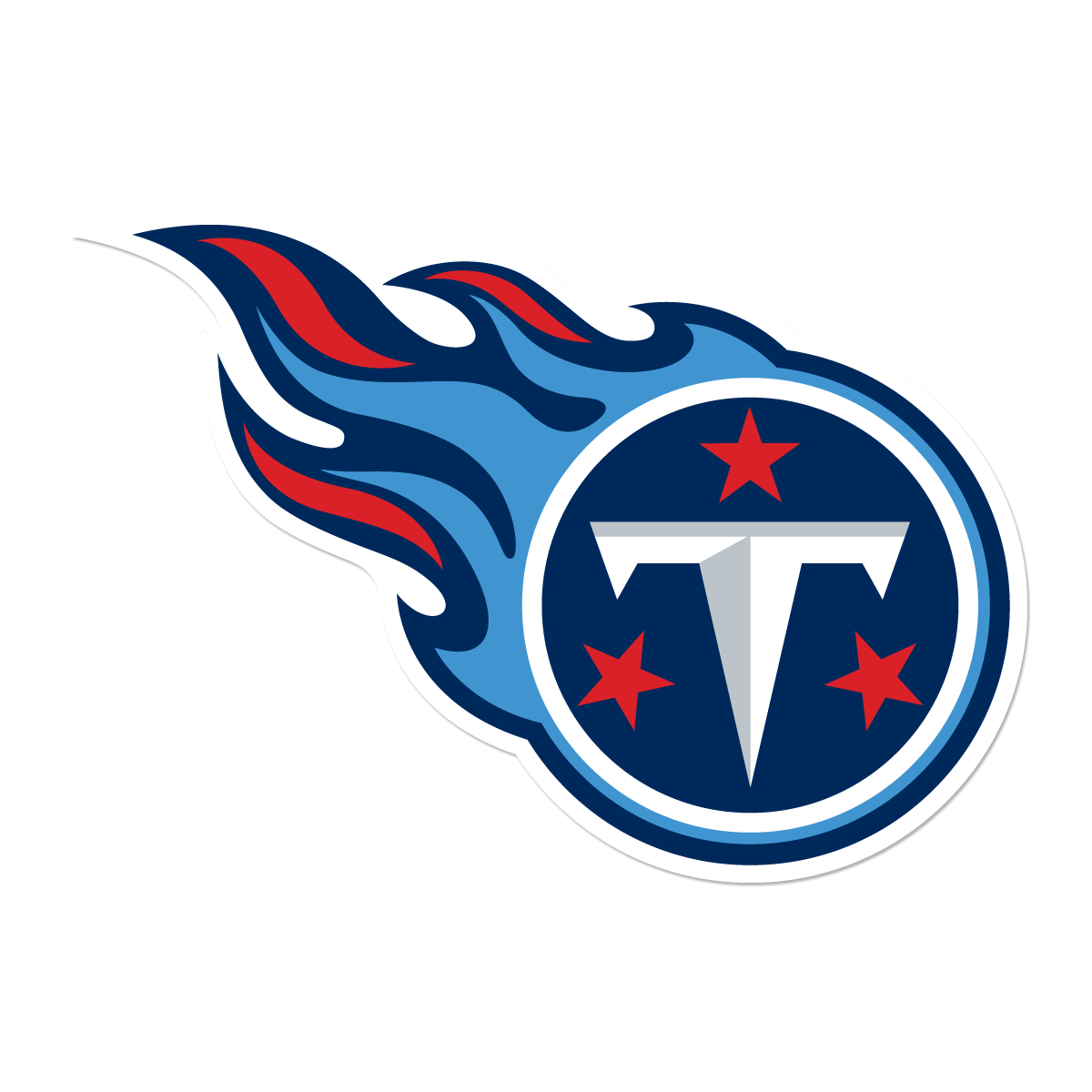
- The Tennessee Titans logo includes a white ring that symbolizes the sun with three stars inside placed against a dark blue background and a large letter “T” that reminds a sword.
- There is also fire which makes it look like a comet.
- Color The team’s palette includes such colors as navy, Titans blue, red, metallic silver and white.







Leave a Review