Technicolor logo and symbol, meaning, history, PNG
- Meaning and history 1914 – 1936 The Technicolor logo from 1914 featured a simple yet bold and solid black logotype in the uppercase, executed in a confident serif font and placed on a white background.
- It was a solid black square with a large white circle on it.
- The logotype of the brand was written in a black title case and executed in a custom extended typeface with barely visible serifs at the ends of the letter lines.
- 1971 – 1986 The redesign of 1971 redrawn the Technicolor logotype in a monochrome color palette, enlarging all of the elements and emboldening the lines.
- The typeface of the inscription was switched to a modern sans-serif with shortened lines of the letters “E” and “C”.
- 1986 – 1990 In 1986 the Technicolor logo was changed again.
- The badge looked strong and modern, yet at the same time evoking a sense of timeless elegance.
- 1990 – 1994 Until the 1990s, the visual identity of a French company has always n executed in a monochrome color palette and had a bright red accent in it only once.
- It was a colorful Film image placed above the massive and extended black wordmark executed in a bold geometric sans-serif typeface.
- The stable inscription was balanced by the lightness and freshness of the graphical part and its smooth rounded lines.
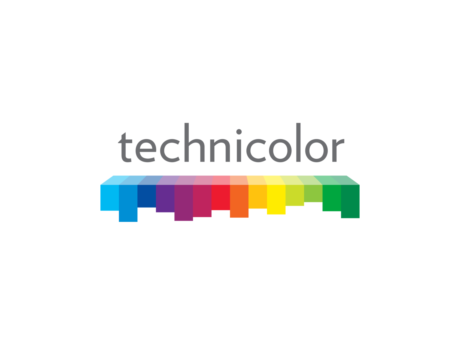
- 2010 – Today The Technicolor logo we all can see today was designed in 2010.
- Under the wordmark, there is an emblem, which also plays an underline part for the lettering.
- The geometric emblem is composed of several colorful rectangles of different heights, which show all the rainbow color palette, reflecting the industry of the company and its specialization.
- The emblem also reminds of a sound equalizer, pointing on the creative and progressive approach of the company with a very rich history and intense legacy.






Leave a Review