Tangled logo and symbol, meaning, history, PNG
- Today it is one of the most popular brands among the little girls across the globe, which has several books, movies, and tv-series created under the brand.
- Meaning and history The visual identity of the Rapunzel stories is girly and tender.
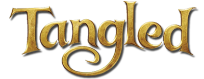
- The official version of the Tangled logo is executed in gradient gold and features a glossy metallic pattern, which makes the whole wordmark look three-dimensional and vivid.
- The lettering in a title case is written in a fancy serif typeface with elongated tails and sharp thin serifs of the letters.
- The main element of the nameplate is the letter “G” and its long curved tail, which underlined the letter “N” and makes it bottom part a little archer up.
- Another color variation for the Tangled logo is purple and white.
- This version is flat, unlike the gold one, and here each letter has a distinct white outline, which allows placing the emblem on any possible background without losing its visibility and sol-idness.
- Simple and elegant, the Tangled logo has everything it needs to show the purpose and the audience of the franchise, without forgetting its main company, Disney.




Leave a Review