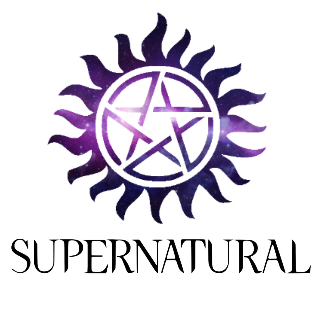
Supernatural logo and symbol, meaning, history, PNG
- Download PNG Supernatural Logo PNG The American fantasy horror television series Supernatural, which was created by Eric Kripke, has had a distinctive wordmark since it was first broadcast in 2005.
- In addition to it, the movie featured several symbols, with a slightly different meaning than they typically have in occultism.
- Meaning and history The original Supernatural logo, which was introduced in 2005, featured quite a regular typeface.
- Although it was an all-cap font, the first letter was a bit higher than others.
- All the following wordmarks looked much more sinister due to the choice of color and unusual visual effects.
- For instance, the Season Two wordmark was given in “fiery” letters, the Season Three logo had an effect of a lightning bolt, the Season Four emblem looked “bloody”, while the Season Seven letters resembled black blood.
- Pentagram symbol Both the heroes, Sam and Dean, have a Protection Tattoo depicting a pentagram.
- One of the most well-known occult symbols, pentagram, is most often used to convey the idea of five elements.
- However, in the Supernatural series the pentagram has a different meaning.
- The tattoo is one of the ways to protect Sam and Dean from evil forces: it does not let demons possess their bodies.
- Font Arguably, the most unusual feature of the Supernatural symbol is that the wordmark has a downward direction.
- The letter “R” has a longer right end pointing down, while the “A” and the “L” are positioned a bit lower in the line.
- Possibly, the design team was trying to convey the idea of moving down, to the world of the dark forces.
- Color The Supernatural logo has gone through various color palettes, aiming to create a sinister impression.


Leave a Review