Sunoco logo and symbol, meaning, history, PNG
- Meaning and history Sunoco LP is a master limited partnership based in Dallas, Texas.
- It was founded in 1886.
- 1886 The original Sunoco logo reflected the old name.
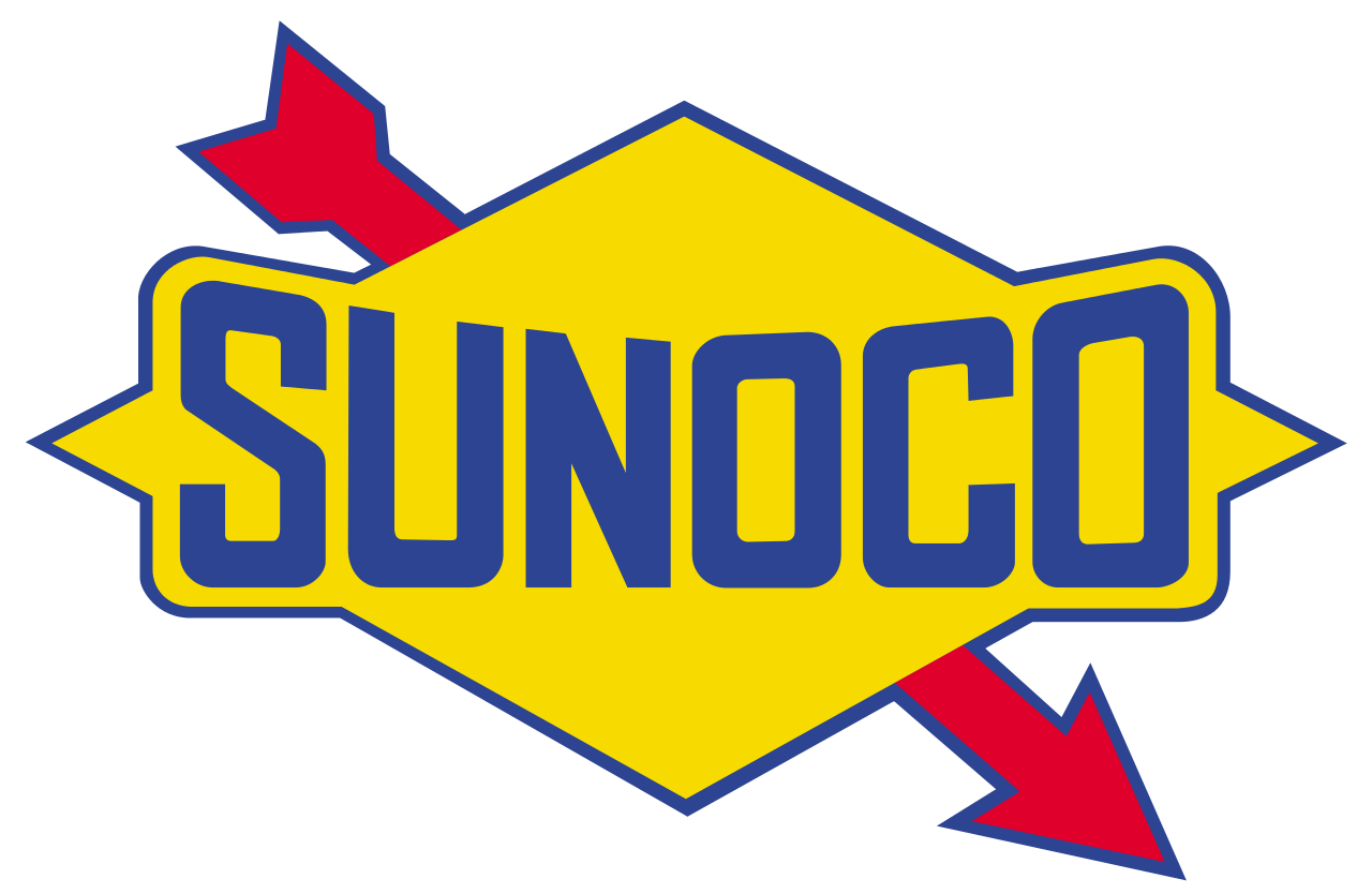
- The design featured the lettering “Sun Oils” squeezed inside a rhombus.
- The effect of being squeezed appeared because the letters came very close to the sides of the rhombus.
- The rhombus was yellow with blue trim, the letters were blue.
- 1920 The rhombus grew somewhat flatter.
- While in the previous logo, the middle letters were higher than the final and the initial ones, the approach was different here.
- In the updated version, the central part was somewhat lower than the sides, although the difference was not as dramatic as in the original logo.
- Another notable alteration was the red arrow.
- 1999 The design forces behind the Sunoco logo decided to return to the original palette with its muted tones.
- The arched lettering was straightened.
- The dynamic effect was reinforced by the blue strokes that appeared above and below the wordmark.
- The color palette of the Sunoco emblem is based on three shades — yellow, blue, and red — a combination, which evokes a sense of growth and progress, pointing at the company’s professionalism and reliability.





Leave a Review