Strasbourg logo and symbol, meaning, history, PNG
- The club, nicknamed “Les Coureurs”, which means “The Racers”, plays in the Ligue 1 and has Thierry Laurey as the head coach.
- 1997 — 2006 The emblem, designed for the club in 1997 boasted a solid bright blue circle with the part of the Star in deep blue and white outline, placed on the left side of the badge.
- The Star featured smooth sleek lines and had three smaller stars in yellow on it, placed along the circle’s perimeter.
- The wordmark “Racing Club de Strasbourg.
- Football” was located around the emblem, replacing the frame.
- The dark blue inscription in all capitals was executed in a bold modern sans-serif typeface and perfectly balanced the star on the circle.
- The two shades of the blue, yellow, and white color palette of the logo represented the reliable and loyal football club, showed its energy and willingness to win.
- 2006 — 2012 The logo was redesigned in 2006, bringing a completely new approach to the club’s visual identity design, and a new, patriotic color palette.
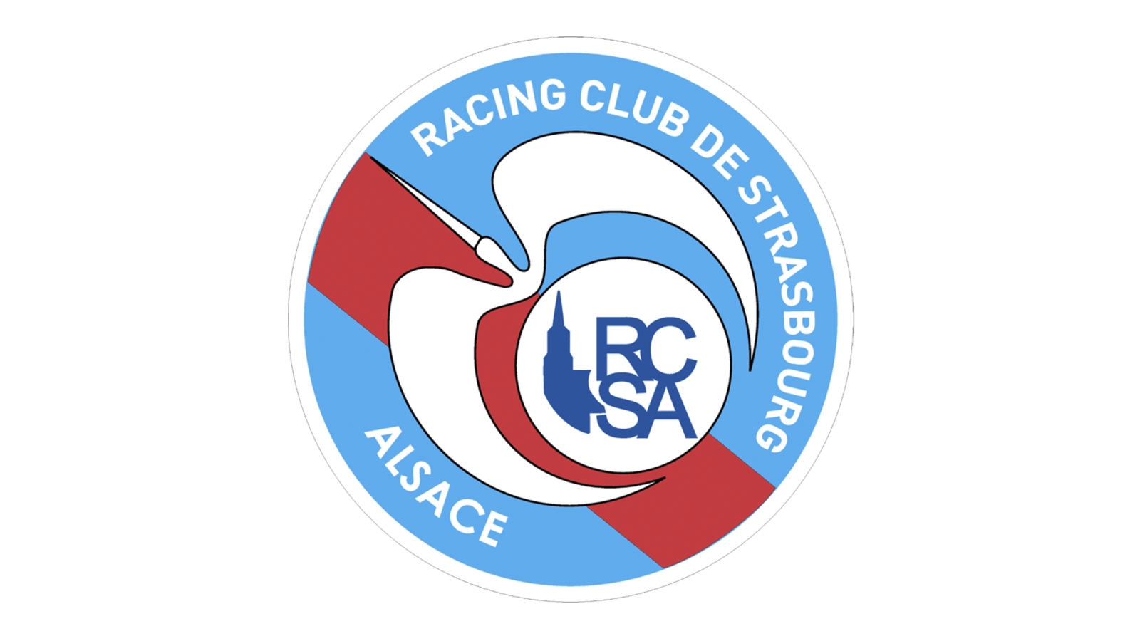
- On the line, the white smaller circle was placed, and a stylized image of a flying bird, also in white, with a thin black outline.
- As for the white circle, it comprised the RCS monogram executed in sleek bold lines, colored blue, and a solid blue tower silhouette, symbolizing the city of Strasbourg.
- The main wordmark in white was located around the perimeter of the badge, from the inside.
- 2012 — Today In 2012 the club’s name was changed to Racing Club de Strasbourg Alsace, which was reflected in the redesigned emblem of the team.
- The composition of the logo remained the same, just a few modifications were made — the red stripe now features plain color, with no gradient shades.
- And the monogram inside the white circle gained one more letter, and now boasts “RCSA” in a stricter and cleaner sans-serif typeface.


Leave a Review