Stoke City logo and symbol, meaning, history, PNG
- Meaning and history The logos the club was using in the second half of the previous century looked pretty loaded with details.
- This is especially true about the logo Stoke City used in 1953-1957 and 1992-2001, which even had a Latin motto on it.
- 1953 – 1957 The Stoke City insignia, designed in 1953, featured a traditional heraldic symbol as the only element.
- The white crest with arched sides had a dark red top part with golden ornaments and a bold Red Cross in the center.
- The cross was separating the shield into four equal segments, with black images in each of them.
- 1977 – 1989 In 1977 the logo of Stoke City was redesigned.
- It was still a heraldic crest in red, gold, white, and black color palette, but in a completely different execution and style.
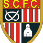
- The shield featured a thick golden outline and had its body divided into four segments — two boasted a vertical white and red pattern, and the other two were solid black.
- On the black square, there were white images — a rope and a tower.
- The upper part of the crest featured a solid red background and a bright yellow “S.
- The bright yellow lettering switched its color to white, which made the whole crest more balanced and elegant.
- The red and white vertical stripes became thinner and the white element on the black background were redrawn in a smaller size.
- 1992 – 2001 In 1992 the club decided to come back to its traditional heraldic logo from 1953.
- The crest was not changed at all but got two additional ribbons — above and under the main shield.





Leave a Review