Stockton Ports logo and symbol, meaning, history, PNG
- Download PNG Stockton Ports Logo PNG The Stockton Ports (Cal League) were founded in 1941 as the Stockton Flyers.
- Though, there was a period (2000-2001) when the franchise was called the Mudville Nine.
- This baseball team’s location has always been Stockton, California.
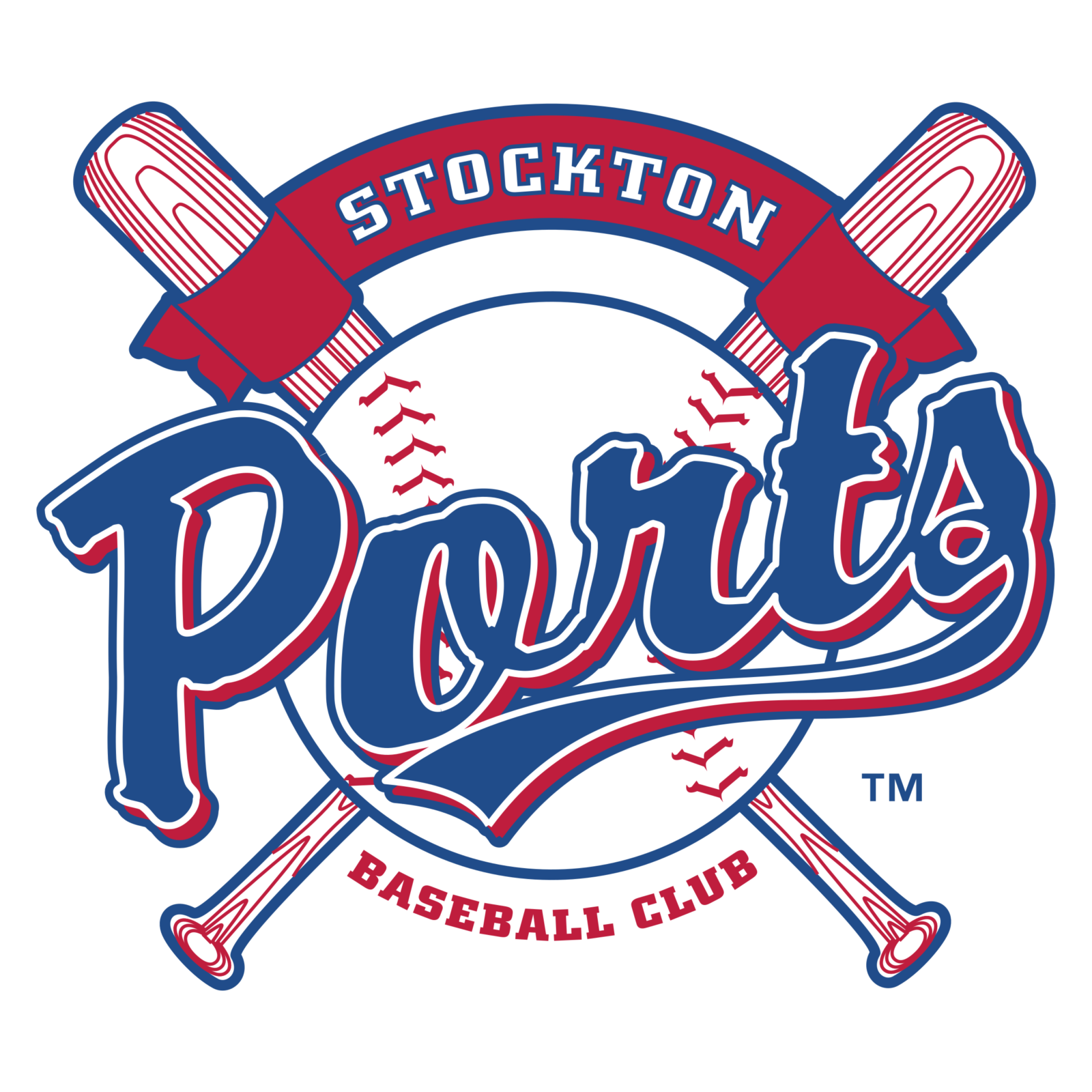
- Meaning and history The primary logo that the Ports have had since 2002 is classic and conservative, and they are not inclined to abandon this traditional look.
- The imagery includes a baseball against the background of two crossed bats, a red banner on the top with the word “Stockton” written in white and the wordmark “Ports” across the baseball.
- The “Ports” is in a blue westernized script trimmed in white and red.
- The letter “S” has a long stylized tail that looks like a ribbon worn on the Navy uniform.
- To some extent the logo resembles a ship’s steering wheel.


Leave a Review