Stockton Heat logo and symbol, meaning, history, PNG
- Meaning and history 1977 — 1987 The first logo was created in 1977 and featured a bold and solid black red and white composition, with the sea theme as the main one.
- The red and white ship steering wheel was drawn on a black smooth background with arched shapes.
- 1987 — 1992 The redesign of 1987 introduced a new concept of the club’s visual identity.
- It was a badge in a fresh green and red color palette with both elements of the logo placed on a white background.
- Now it was placed on a white background and enclosed into a black circular frame, which was way thinner than on the previous badge.
- It was a colorful yellow and red badge with the yellow hockey stick placed horizontally and forming an underlined for the stylized two-leveled logotype.
- The upper part of the inscription featured solid black “Saint John” in the uppercase of a traditional bold and slightly slanted sans-serif typeface, while the bottom “Flames” was written in thicker lines, using a yellow and red gradient for its capital letters and a thin black outline.
- 1998 — 2003 A new symbol was adopted for the club’s logo in 1998 — a red dragon with the flame coming out of its mouth was drawn above and behind the sharp uppercase logotype in white, with a black and red outline.
- The red Sharon represented power and determination and showed the club as a strong and dangerous competitor.
- 2005 — 2007 The redesign of 2005 was made for the new team’s name, Omaha Ak-Sar-Ben Knights.
- 2007 — 2009 In 2007 the name and logo of the hockey club were changed again.
- The new concept included only two stylized overlapping letters in red and yellow, with left parts of both letters drawn as flames.
- Both elements of the logo featured a thin black outline, which made the badge look cleaner and more confident, creating a delicate and elegant contour and contrast.
- 2009 — 2014 The logo for the Abbotsford Heat hockey club was introduced in 2009.
- It was a sharp Iago ally placed wordmark banner with a red black and white graphical element — a hockey puck with a sharp red trace, placed vertically above the last two letters of the “Heat” part.
- The badge of this season featured a stylized letter “A” in red, with the smaller white letter as its negative space and a delicate smooth stylized flame in it.
- The letters featured a double yellow and black outline both from its outside and inside.
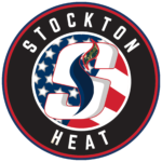
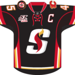
- 2015 — Today The Stockton Heat logo is based on the roundel shape.
- A large “S” with black and yellow flames can be seen in a red circle with the white outline.
- Video







Leave a Review