Contents
Springfield Thunderbirds logo and symbol, meaning, history, PNG
- It was formed out of the Portland Pirates franchise not long before the 2016/17 season.
- Meaning and history 1981 — 1982 The logo of 1981 introduced the original name of the hockey club — the Erie Blades.
- The solid blue ice skates with the blade are replaced by a stylized yellow “Blades” inscription in a custom sans-serif typeface with smooth rounded letters.
- This logo only stayed with the club for a few months.
- 1982 — 1983 The redesign of 1982 introduced a completely different badge for a completely different name of the club.
- 1983 — 1988 The logo was redrawn again in 1983, and this time it was a badge, that stayed with the club for longer than a few months.
- The steering wheel was stylized in black and white, and the wordmark was shortened to just “Jacks”, being written in bright yellow uppercase letters in an elegant serif typeface with the tail of the “J” elongated and curved.
- 1988 — 1993 In 1988 the color palette of the logo was switched and the black circular background became red, with all the steering wheel outlined also turning red.
- As for the main hero of the badge, the wordmark, it kept the typeface and size, but also switched the color scheme and now was written in a calm yet the intense shade of blue, outlined in medium-thick white and thin red.
- In this variation, the badge looked brighter and evoked a sense of style and passion.
- 1993 — 2000 The Portland Pirates era started for the hockey club in 1993.
- So the first version depicted a stylized portrait of a pirate placed on a white circle with a red and black outline.
- The whole drawing was executed in this traditional and elegant color palette, as well as the lettering.
- The “Pirates” in gothic cursive was arched above the circular badge, written in extra-bold black lines, while the “Portland” part of the inscription was written in a straight line under the portrait, executed in a slightly narrowed traditional and elegant serif font, also in black.
- The enlarged “Pirates” wordmark was written under the image in black and red uppercase letters executed in a bold and classy serif font, and outlines in white and black, with the whole badge.
- 2015 — 2016 The redesign of 2015 kept the graphical image of the previous badge, enlarged all the elements, and removed the “Portland” part of the lettering from the logo.
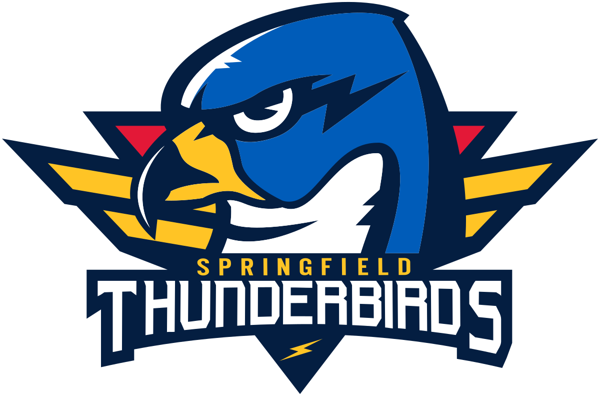
- 2016 — Today The primary Springfield Thunderbirds logo features the head of a bird.
- The head itself is blue, the beak is golden, while the part of the bird’s neck that can be seen under the beak is white.
- The logo was designed by Matthew McElroy.
- Video




Leave a Review