Sporting logo and symbol, meaning, history, PNG
- Meaning and history When you think of Sporting FC, the lion rampant is one of the first things to come in mind.
- This symbol has been with the club like forever since the very first logo was created for them in the 1900s.
- 1907 — 1913 The very first emblem for the Portuguese club was designed in a very minimalist yet bright style.
- It was a green circle with a solver gray lion rampant in the middle and “SCP” letters in bold sans-serif around the animal contour.
- It was clean, laconic, and remarkable.
- 1913 — 1930 In 1913 the lion becomes white and is being placed on a green shield with smooth curved contours.
- The shield is enclosed in a black circular frame, where the “Sporting Club de Portugal” inscription in all capitals was written in white.
- 1930 — 1945 The redesign of 1930 takes the circular frame away, and the smooth elegant medallion in green with a white outline comes out.
- C. P.” Letters placed around it.
- 1945 — Today In 1945 the new logo was designed for the famous club, and it is still in use today, along with another one, created at the beginning of the 2000s.
- The badge itself gained a thicker white outline and started looking more elegant and professional.
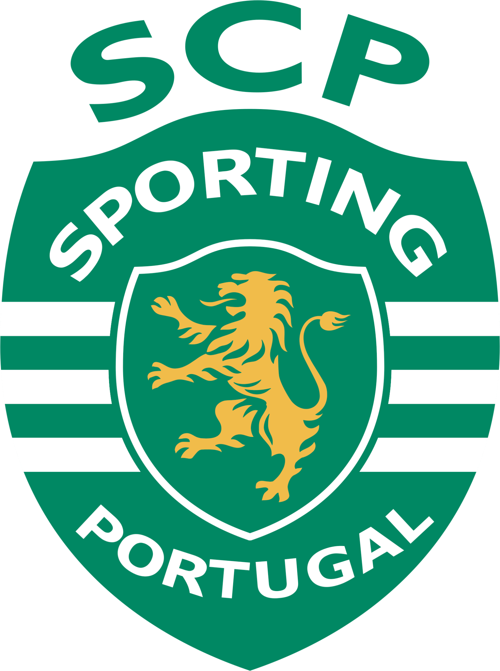
- 2001 — Today Another logo, which the club uses today, was created in 2001 and is a modernized version of the lion crest.
- The “Sporting Portugal” inscription in white is placed inside the shield, while the green “SCP” letters are written above it.
- Sporting Colors GREEN PANTONE: PMS 3415 C HEX: #008057 RGB: (0, 128, 87) CMYK: (88, 26, 80, 12) GOLD PANTONE: PMS 123 C HEX: #F3C242 RGB: (243, 194, 66) CMYK: (4, 24, 87, 0) WHITE HEX: #FFFFFF RGB: (255, 255, 255) CMYK: (0, 0, 0, 0) Video


Leave a Review