Spirit Halloween logo and symbol, meaning, history, PNG
- Download PNG Spirit Halloween Logo PNG Spirit Halloween is an American brand of decorating items for Halloween, which was established in 1983 by Joseph Marver.
- Today the company, founded in New Jersey, operates not only in the United States but across North America and other continents through its website.
- Meaning and history The Spirit Halloween logo is colorful and ornate, showing one of the most favorite children’s fiesta, and the creative approach of the company to product selection.
- The logo, composed of an orange and black emblem is accompanied by a black bold tagline in all caps, which balanced the multicolor image and works as an underline, framing the logo and adding a touch of professionalism and expertise.
- The emblem of the brand is composed of a solid orange rectangle, placed horizontally, with a white skeleton in black hooded coat image, and yellow details.
- The “Spirit” inscription in a stylized serif font with bold lines is surrounded by small four-pointed stars in the same yellow color with a thin black outline.
- The “Halloween Superstores” wordmark is placed under the orange rectangle and executed in a custom serif typeface with pointed ends of the letters “L”.
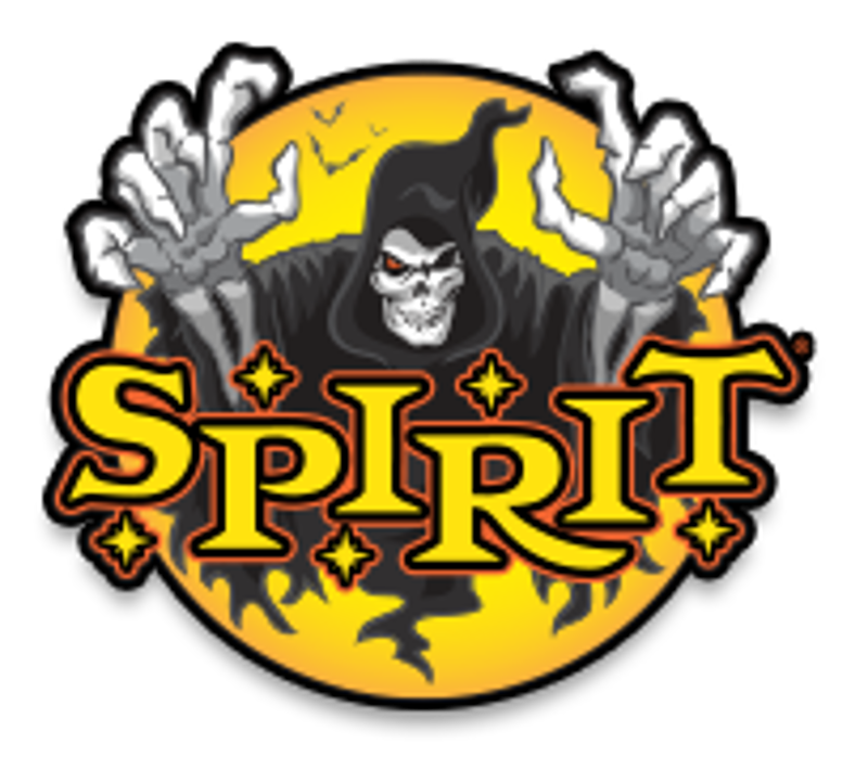
- There is also another version of the logo in use by the brand, which also depicts a skeleton in a black hood, but this time it is placed on a rounded yellow background and has the “Spirit” wordmark enlarged and placed on the bottom part of the emblem, outlined in black and red.
- Font and color The orange and black color palette of the Spirit Halloween logo is the combination, which comes to mind first when you think of the famous “trick or treat” holiday.
- It represents autumn, pumpkin jack-o-lantern, and of course, evil and fright.
- The custom typeface of the wordmark is solid and bold, it adds a sense of profes-sionalism and expertise of the company, shows its stability and confidence.




Leave a Review