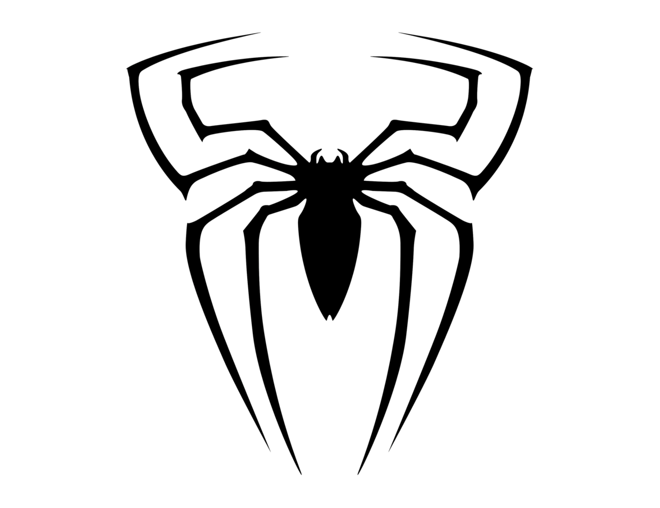
Spiderman logo and symbol, meaning, history, PNG
- However, the logo remained identical.
- It was only in 1984 that the logo was heavily modified.
- Due to its white color, it stood out against the black background.
- Interestingly enough, the idea for the costume was contributed not by a professional designer but by a fan, Randy Schueller.
- 2013 emblem The Superior Spiderman logo (2013) designed by Humberto Ramos was inspired by a draft, which Alex Ross created for the first episode of the series.
- The spider was bigger than in most other costumes and had an unusual outline.
- Alternative logos We cannot but mention the 1992 design created by Rick Leonardi.
- The outfit belonged to the first Hispanic Spider-Man.
- The Ultimate II version introduced in 2011 sported a red insect against the black background.
- The author of the image was Sara Pichelli.
- Font The Spiderman logo does not include any wordmark.
- The way the superhero’s name is shown may differ from one episode of the series to another.
- Color In most cases, the spider and its net are black, while the background is red.
- Some of the exceptions to this rule include the versions that appeared in 1984 (white spider, black background) and in 1994 (blue background), as well as special costumes.


Leave a Review