SPAR logo and symbol, meaning, history, PNG
- Download PNG SPAR Logo PNG SPAR company has a rather long history, it was founded as a supermarket chain in Amsterdam, the Netherlands in 1932 by Dutch entrepreneur Adriaan van Well.
- At the time of a world economic crisis, he elaborated a plan of uniting the efforts of grocery shopkeepers and wholesalers in trade and advertising for mutual benefit.
- During the fifties, it covered almost all Europe.
- Nowadays, the trademark “SPAR International” unites more than 13 thousand supermarkets in 48 countries.
- Meaning and history The visual identity history of Spar is a representation of the company’s growth and progress, as its original emblem, introduced in 1932, was only modernized and refined throughout the years, pointing to the strong sides of the brand and its values — legacy, quality, and attention.
- 1932 – 1940 The company was established in 1932 in De Spar, so this was the lettering, written in white on a red rectangular banner, placed on the bottom part of the original brand’s logo.
- The logo featured a solid green, enclosed intro a thick red frame with additional white lettering on it.
- The tree was a bit enlarged and had its lines elongated, looking elegant and powerful.
- 1950 – 1960 The name of the company was changed to Soar in 1950, and the logo was redesigned in the same year.
- The lettering was enlarged, so the red banner was thickened, balancing the wide lines of the tree.
- 1960 – 1968 The tree became smaller and the framing with the banner was enlarged in 1969.
- The red banned with the white custom lettering is now detached from the emblem and can be placed where on the left from it, or under the frame.
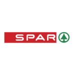
- Font and color The Soar logotype is written in all capitals of a stylish and futuristic sans-serif typeface, which looks close to such fonts as Nedian Bold and Consilio Bold, but with the ends of the lines slightly sharpened from one side, and with the contours of the “P” and “R” open.
- The green, red and white color palette of the brand’s visual identity is not only a delightful and eye-catching combination but also a reflection of the successful and confident brand, its expertise, and attention to the customers.


Leave a Review