SPAL logo and symbol, meaning, history, PNG
- Football Club logo PNG The name of the football club, S.P.A.L.
- 2013, is short for Società Polisportiva Ars et Labor.
- The club, which competes in Serie A, was established in Ferrara, Emilia Romagna, in 1907.
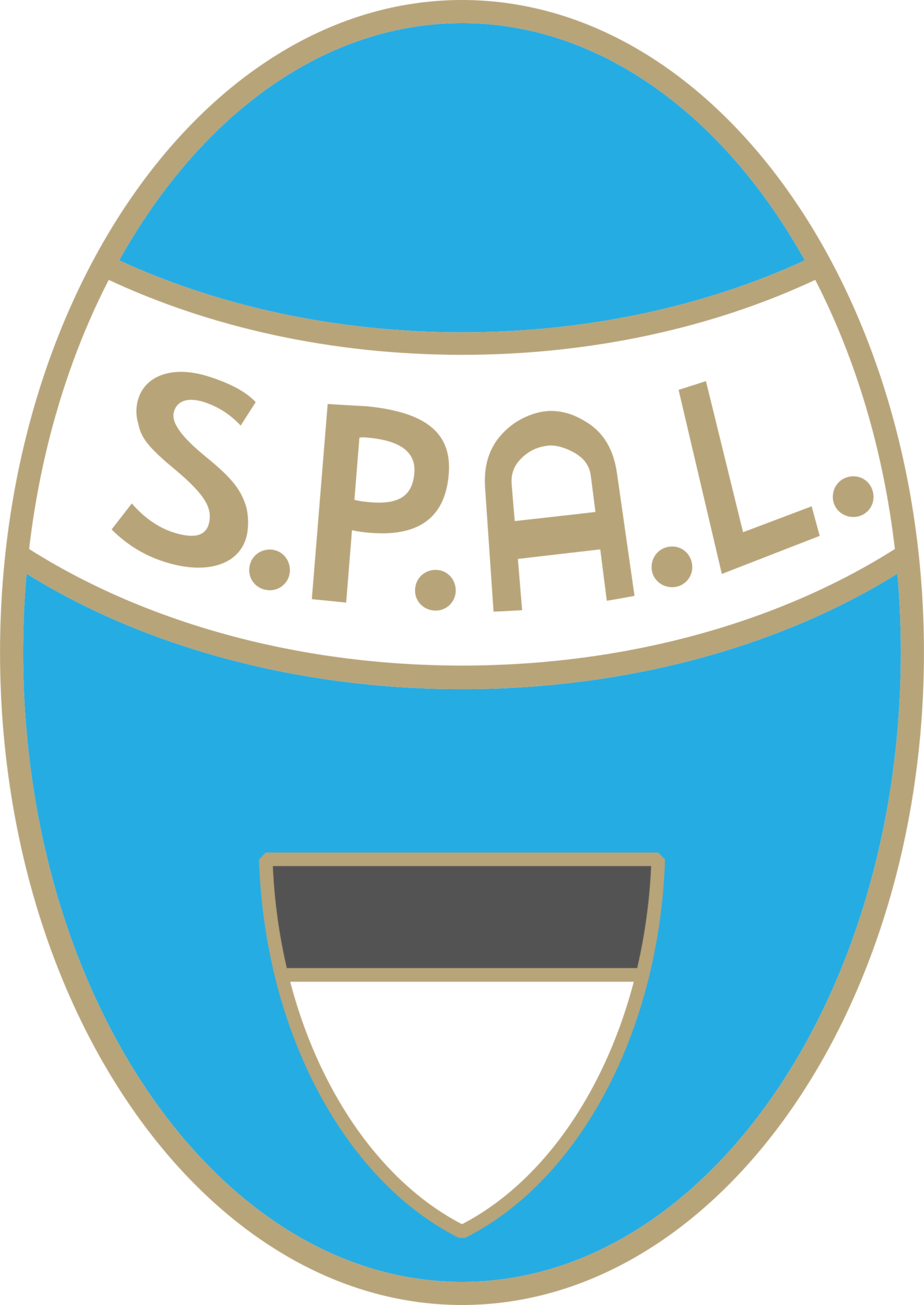
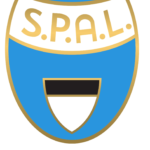
- 1995 — 2005 The S. P. A. L. Logo, created in 1995 boasted a sophisticated light blue, white and black color palette with a delicate addition of gold lines and letters.
- It was a vertically oriented oval with a sky-blue background and gold frame.
- The bottom part of the medallion was embedded with a white and black triangular crest, and the top part of the badge had a wide white arched banner with the sand-serif gold lettering on it.
- 2008 — 2012 The egg-like crest with a crown became an element of the new badge, designed in 2008.
- It was a smooth three-dimensional white and light blue badge with black “SPAL” lettering on top, a “1907” date mark on the bottom, and a vertically striped square element in blue and white in the center.
- The glossy surface of the badge looked sleek and stylish in combination with the bold and modern sans-serif typeface of the club’s name inscription.
- It was a truly memorable and eye-catching logo, which stayed with the club for less than four years.
- 2012 — 2013 The light blue medallion from 1995 came back as the official logo of the club in 2012.
- 2013 — Today The redesign of 2013 was all about the color palette of the SPAL visual identity.
- The background of the vertically set oval became lighter, as well as the gold shade of the framing and lettering.
- As for the triangular crest on the bottom part of the badge, it got its colors muted as well, with black turning gray.





Leave a Review