Sonic logo and symbol, meaning, history, PNG
- The rotated “O”, for instance, has been the distinctive feature of the wordmark ever since it was launched in 1991.
- Meaning and history The visual identity of Sonic the Hedgehog is known by kids and adults all over the globe.
- It was redesigned just once, in 1999, and the only thing that was changed was the color palette, while the simple clean contours of the emblem remained almost untouched.
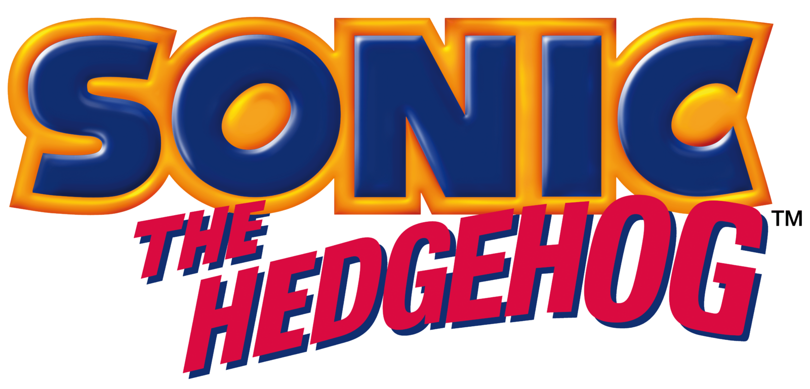
- 1991 — 1999 The original logo for Sonic the Hedgehog was created in 1991 in two variants — for the international market, and local, Japanese.
- The Asian version of the logo featured a dark blue “Sonic” lettering in all capitals with “The Hedgehog” tagline, written in the same color but with a different, simpler typeface.
- For the international version, the logo was made three-dimensional, by adding some gradients.
- Also, the inscription gained a thick orange outline, and its tagline was written in shadowed red letters of a traditional sans-serif font, placed on a wavy line.
- 1996 In 1996 the Sonic logo was redesigned.
- On the right part of the oval — a bold white inscription in three levels “Sonic Team Presents” executed in a modern and strong sans-serif typeface 1998 The redesign of 1998 made the badge monochrome and flat.
- 1999 — Today The redesign of 1999 switched the color palette of the Sonic logo, turning the main inscription yellow and outlining it in blue.
- As for the tagline, it is now written in white and placed on a red horizontally stretched banner under the “Sonic” nameplate.
- The white letters are executed in a strict and bold sans-serif typeface with a thin blue shadow.
- Unlike their predecessor, they were three-dimensional and featured a less modest color palette including bright blue, pink, golden and dark blue, red, and yellow respectively.
- The 2006 emblem The typeface used for the word “Sonic” underwent a subtle modification, as the result of which the letters have grown bolder, while the outline has grown thinner.
- The palette has been reversed: now, the letters are yellow, while the outline is blue.
- The wordmark itself lost some of its volume, yet the 3D effect is still there.
- The colors here have been reversed, too: the text is white, while the background is red (and this is a different shade of red than in the previous versions).
- Font The word “Sonic” is given in a custom typeface based on Syntax Ultra Black.
- Color The 2006 version of the Sonic logo combines red, dark blue, yellow, and white.
- There are several shades of red and yellow, which is necessary for creating a 3D effect.


Leave a Review