Sokolov logo and symbol, meaning, history, PNG
- Today the brand has more than 6 thousand stores across 12 countries and is very popular and loved for its unique and elegant jewelry masterpieces.
- Meaning and history he Sokolov visual identity is a perfect example of a contemporary luxury fashion brand logo.
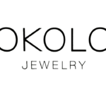
- Composed of a wordmark set in two levels it looks strict and minimalist, yet shows the essence of the brand.
- The Sokolov wordmark in all capitals is executed in a thin traditional sans-serif typeface with rounded shapes and straight distinct angles and cuts of the letters.
- The large size of the main inscription is balanced by smaller lettering placed under the thin straight horizontal underline.
- The “Jewelry” part of the brand’s nameplate is written in the same typeface, but the letters are placed closer to each other, so the inscription looks more compact and emphasizes the upper part of the logo.
- The Sokolov logo is simple and laconic, it is timeless and always actual due to its lightweight composition and a classic black and white combination.
- It has a lot of air and created a sense of balance and harmony.






Leave a Review