Snickers logo and symbol, meaning, history, PNG
- Download PNG Snickers Logo PNG Snickers is an iconic label of chocolate bars, produced by Mars, which was founded in 1932.
- The brand is extremely popular across the globe and is known for its funny and strong advertising campaigns.
- Meaning and history The world’s most famous chocolate bar was named after the horse.
- It was a favorite horse of the founder’s family and made a great branding for the popular sweet snack.
- 1930 — 1939 1939 — 1985 The first Snickers logo was introduced in 1939 and featured a wordmark and a star symbol on its left.
- The wordmark was executed in all capital letters, which were sharp and brutal.
- The black nameplate had a brown outline, which resembles chocolate.
- The star used the same color palette as the inscription.
- The lettering now featured a refined and more modern typeface and the color palette switched to blue.
- 1990 — 2000 In 1990 the wordmark gets a thin rectangular framing with rounded angles and inclined sidebars.
- All the other letters are equal in size and look compact and bold.
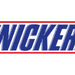
- 2005 — Today The redesign of 2005 makes the logo frame thinner and brings back the all-capital letters to one height.
- The lines of the typeface are refined and modernized and the letters gained a thin white shadowing, which adds volume and dynamics to the logo.
- The Snickers typeface is very similar to Lunch Time Normal font, an elegant and strong one.





Leave a Review