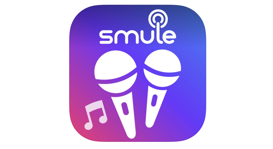
Smule Logo and symbol, meaning, history, PNG
- Meaning and history The brand was started in 2008 by Jeff Smith and Ge Wan.
- It was originally headquartered in Palo Alto, California.
- 2008 — 2014 The original Smule logo looks pretty much like the 2014 version.
- You can see the name of the brand in a rounded minimalist type.
- All the strokes that could be removed, have been removed (for instance, the “tails” at the top left part of the “M” or the lower right part of the “U”).
- The overall feel is clean and smooth.
- The shape of the letters perfectly fits the circle shape above the “l.” The circle (or three circles, to be precise) paired with the letter represents a human finger pressing a button (apparently, on a touchscreen).
- We can assume it is a kind of a “play” button.
- Also, there is another interpretation, which is also relevant for the brand: the “l” as an antenna and the circles as the sound waves (or the radio waves).
- Also, the three thin rings have been replaced by two thicker rings.
- This also has made the picture better visible, while also making it cleaner.
- Font The smooth and clean lines of the type look friendly and evoke the feeling one gets from musical harmony.
- Colors The original palette of the Smule logo combined gray with green.
- Green, as the color of the leaves and the grass, is a very peaceful and relaxing color.


Leave a Review