Skittles logo and symbol, meaning, history, PNG
- Meaning and history The earliest Skittles logo, which was introduced the same year the product was launched, was almost as eye-catching and colorful as the current one.
- However, it lacked the meaningfulness the logo has now.
- 1974 – 1982 The initial Skittles logo was composed of a light gray logotype with a bright yellow solid dot above the letter “I”.
- The color palette was pretty pale and boring, but the lines were stable and clean, which made the whole logo look confident and balanced.
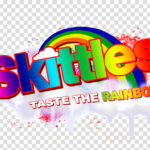
- Now the white outlines in the red logotype were placed on a rainbow background and accompanied by lots of colorful details and additional lettering in the same style.
- The inscription was executed in a bold geometric sans-serif typeface and placed slightly diagonally, in the upright direction.
- The rainbow in the background was a representation of the skittles candies’ variety of tastes.
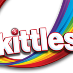
- 2003 – 2007 The contours of the Skittles logo were cleaned and refined in 2003.
- All the extra details were removed from the background, and now only the wordmark, the rainbow, and the “Bite Size Candies” tagline, handwritten in scarlet-red under the main inscription, remained on the logo.
- Red has obviously become the main color of the Skittles visual identity, even though all the original rainbow palettes remained, slightly blurred and with gradients.
- 2007 – Today The background was switched to solid red in 2007.
- The images of Skittles candies were added to the new logo, in different colors, and under different angles.
- Font The typeface featured on the Skittles logo resembles the Helvetica Black font, yet it is definitely a heavily customized version.
- Color The rainbow theme has been present in all the variations of the logo launched since 1982, yet there are two colors that dominate the logotype: red and white.





Leave a Review