Sierra Mist logo and symbol, meaning, history, PNG
- Meaning and history In the original Sierra Mist logo, there was a slice of lemon and a slice of lime placed one in front of the other.
- The word “Sierra” above echoed the style of the “Mist” but it was smaller.
- A lemon and lime slices were drawn above the “S” in “Mist”, reflecting the flavor of the beverage and making the whole emblem brighter.
- This time, though, there were not the slices but a whole lime and a whole lemon.
- The lettering was white (the gradient disappeared).
- The green color and the pattern imitating the shape of citrus fruits were the only reminders of the “lime” theme.
- The design looked lighter and more dynamic due to the disappearance of the heavy color blocks.
- This time, it was dominated by the “forest mist” theme.
- It was introduced partly by the blurry word “Mist” and partly by the forest design in the background.
- 2010 The citrus fruits made a comeback just two years later.
- While the type did not use a gradient, its shape had something “watery” about it, with its rounded angles and “liquid” ends of the letters in the second line.
- 2010 Before the year ended, PepsiCo introduced another version.
- The new design looked generous featuring half of each of the fruits.
- And yet, the water splashed in the background partly made up for the lack of lightness and dynamism.
- The lemon and lime now took the form of green and yellow rings with splashes all around.
- However, the company had to include the lettering “lemon-lime” in the logo to make up for the absence of the citrus fruits themselves.
- This time, there was a whole lemon placed in front of a whole lime.
- 2018 When the brand returned to the original name, a new Sierra Mist logo was introduced.
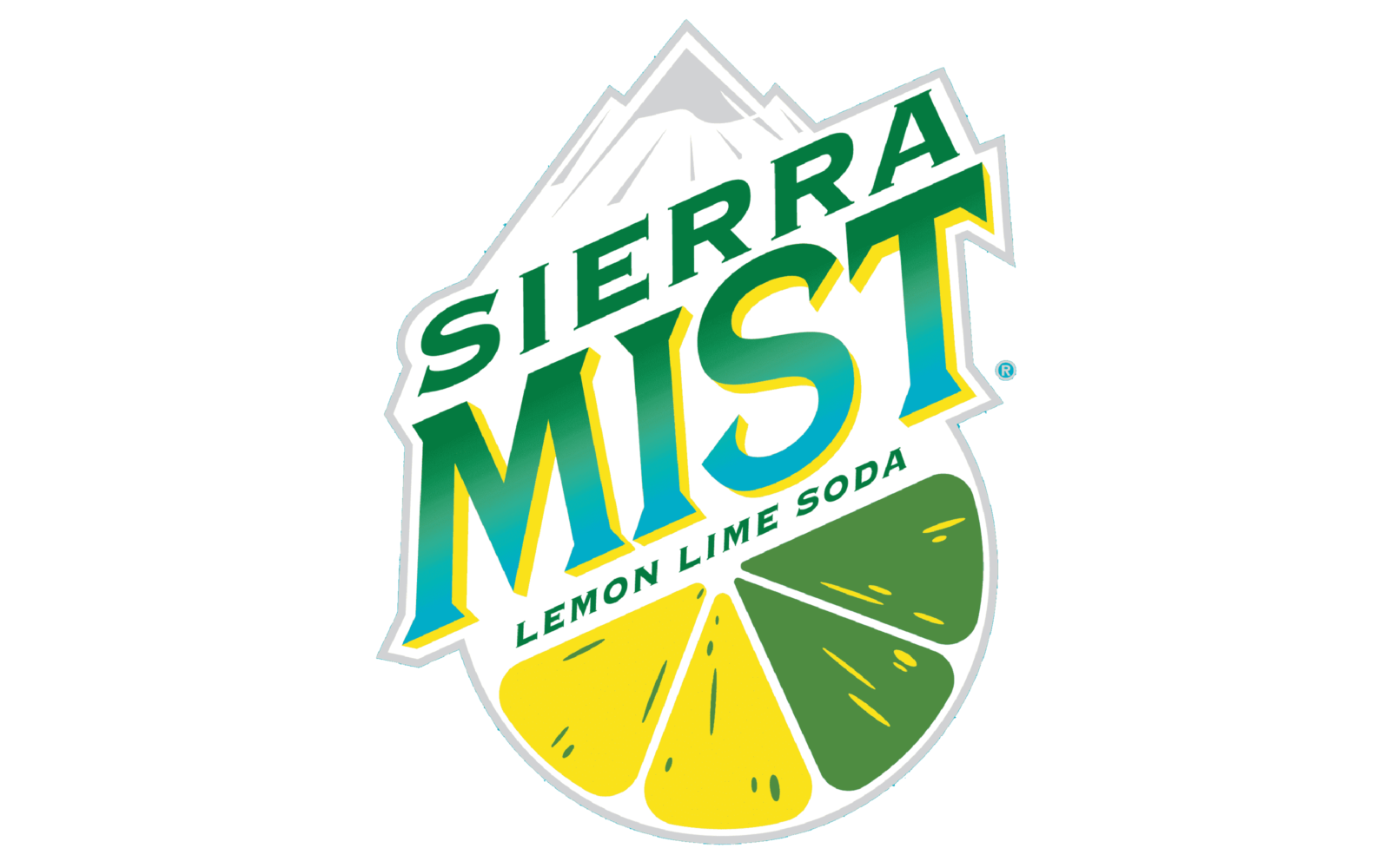
- It includes several motives from the older versions (the mountains, the hybrid lemon-lime slice), although they now look different.
- The font of the brand’s logo looks pretty similar to Porkshop Italic, but with the lines thickened and slightly refined.





Leave a Review