Shriners Hospitals for Children Logo
- Download PNG Shriners Hospitals for Children Logo PNG Shriners Hospitals for Children is an American medical organization, which consists of 22 units across the country.
- It was founded in 1922 and today it helps children with different health conditions in a friendly environment.
- Meaning and history Before 2007 The very first logo for the Shriners Hospitals For Children featured a bright and detailed emblem depicting a man with a kid on his hands.
- The man was walking away and had two wooden crutches in his right hand.
- He was wearing a light blue shirt with a yellow emblem on its back and a red hat.
- The logotype was set on the right from the emblem in black and white, with the “Shriners Hospitals” in massive black sans-serif letters, and “For Children” — in outlined white.
- 2007 – Today The Shriners Hospitals for Children is run by the Ancient Arabic Order of the Nobles of the Mystic Shrine.
- And its visual identity is based on the image of the Arabic man holding a kid.
- It is actually a stylized version of the very first foundation’s logo, which was a picture of a man carrying a child and walking away.
- The original logo was more detailed and colorful, and its typeface looked slightly amateurish.
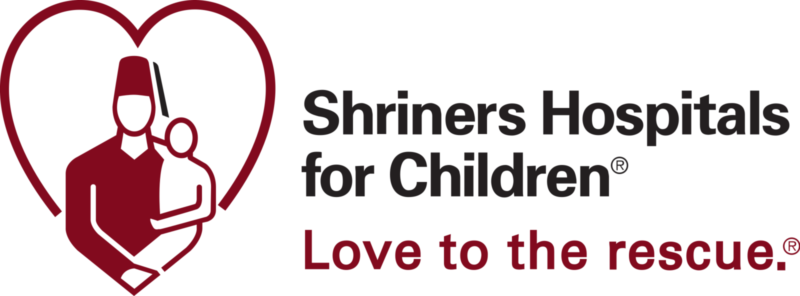
- The current logo depicts the modern and strong contouring of two figures (a man and a baby), forming a heart-shape.
- The figures are placed in the bottom part of a circle frame, which adds balance and harmony to the logo.
- No face details make it look stylish and contemporary, while the shape and the dark red and white color palette reflects the warmth and love, Shriners Hospitals for Children share with the world and their patients.
- It is a very strong emblem, which is accompanied by a modest and traditional sans-serif typeface of the wordmark, executed in red.


Leave a Review