Shopkins logo and symbol, meaning, history, PNG
- By the summer of 2020, there already were 13 seasons of the toys, to say nothing of the complementary seasons like Halloween or Christmas.
- However, in spite of all the updates of the toy line, the Shopkins logo has always remained unchanged.
- We can still mention, though, that there have been some additions to the logo necessary to identify a specific series or item inside the collection.
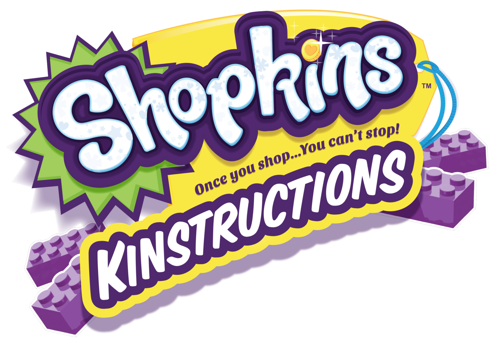
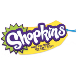
- Primary logo The design focuses on the name of the brand.
- The authors of the logo have opted for a playful and friendly type, which also looks casual.
- Neither of the letters “stands” on the line properly.
- Instead, they look “dancing,” and “hopping,” and even trying to steal the limelight by “showing off” their extended ends.
- The width of the strokes varies from rather bold to moderately thin.
- Yet, the bolder and thinner strokes do not form a rhythmic pattern, like in calligraphy, but rather create an unpredictable image, like the water spilled over a horizontal surface.
- Looking at the wordmark, you can’t say that it’s the result of hard work and multiple discussions (although this is the case, most certainly).
- Behind the lettering, there is a combination of bright green and yellow shapes.
- It looks like half of a banana.
- This impression is only reinforced by the blue “thread” going through the “hole” in the yellow part of the logo.
- The emblem comprises the primary Shopkins logo and the writing “Shoppies” below.




Leave a Review