Senior Bowl Logo
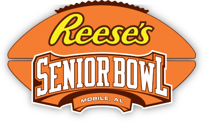
- Download PNG Senior Bowl Logo PNG Since 2013, when the company manufacturing the Reese’s candy took over the sponsorship, the Senior Bowl logo has been heavily influenced by the package design of the candy.
- It was a blue and white badge, with the sponsor’s logotype in the blue set above the red “Senior” in the same style.
- The inscription was accompanied by the Under Armour emblem in blue and white, set above it, and a smooth blue banner with the white “2007” datemark placed under the thin red frame of the lettering.
- It was a sharp and modern badge, which was used as a base for the following redesign.
- 2008 – 2011 The version, introduced in 2008, was made with a stronger accent on the “Senior Bowl” part.
- The Under Armour emblem was also changed, and now it was drawn in blue on a white background, right above the logotype of the brand.
- The “Mobile, AL” inscription in whole serif letters was written over it.
- 2012 – 2013 The redesign of 2012 made things easier and simpler.
- The rugby ball and the sponsor’s logotype were removed from the badge, making the massive and brutal “Senior Bowl” logotype on a red arched banner the only element of the new insignia.
- It was still underlined by a smaller red badge with the same “Mobile, AL” inscription in all capitals of a smooth modern sans-serif typeface, with its while letters outlined in dark blue.
- 2014 – Today What similarities can we see between Reese’s package and the bowl game logo?
- To begin with, we can mention “Reese’s” wordmark, which is given in yellow handwriting-inspired font.
- Also, the logo is dominated by orange, which is the color of the package of the candy (although the shades are slightly different).
- Below the sponsor’s logo, you can see the arched lettering “Senior Bowl.” In the background, there is a large football.




Leave a Review