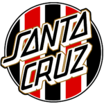
Santa Cruz logo and symbol, meaning, history, PNG
- Download PNG Santa Cruz Logo PNG The Santa Cruz Skateboards brand is distributed by NHS, Inc.
- It is the world’s oldest continuous skateboard company.
- It was established in 1973.
- Meaning and history The original Santa Cruz logo was designed by a graphic artist and Santa Cruz High surfer Jim Phillips in 1978.
- His creative and often monstrous designs are an indispensable part of the NHS imprint today.
- He drew the memorable slanted typeface by hand.
- The most distinctive feature of the type is probably the “A” formed by a closed triangle.
- He also enriched the logo with a second color in the form of a drop shadow.
- Eventually, he placed a large red circle behind the wordmark.
- The circle was soon nicknamed “the dot.” The way the name of the brand looks in the current logo is almost the same as in the original logo.
- According to Phillips, the dot was suggested by Jay Shuirman, the company co-founder.
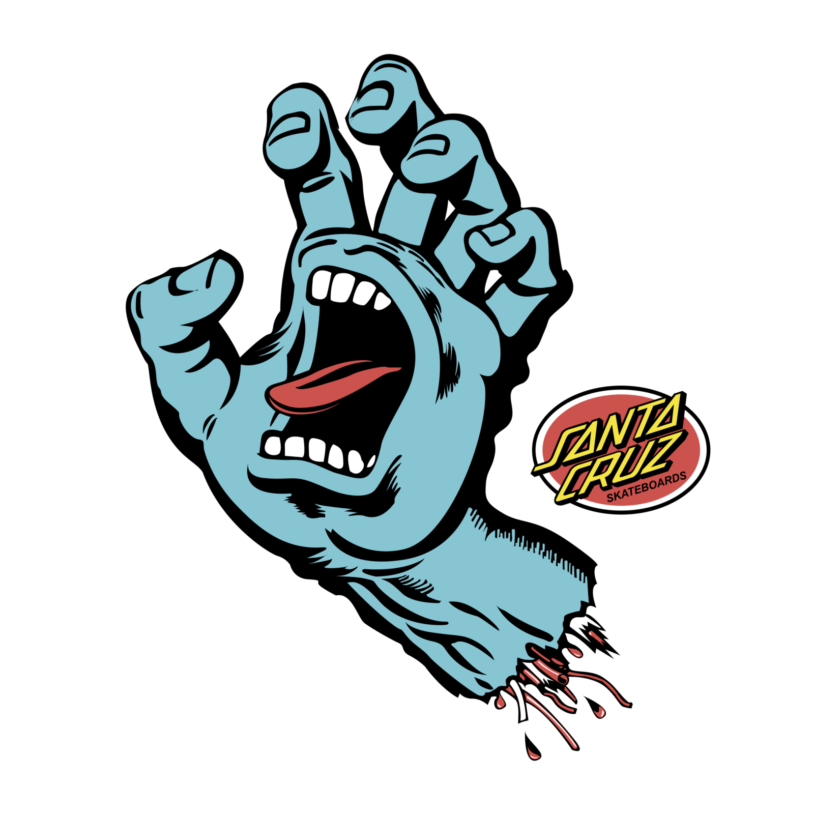
- As Phillips explained, Shuirman placed the original linear design on the wall, sat back considering something, and eventually claimed: “I see a big red dot.” Screaming Hand emblem The iconic emblem features an amputated hand with a screaming mouth in its palm.
- The hand is blue with red and black nuances.
- Alternative symbol Some products bear an additional Santa Cruz Skateboards logo showcasing a yellow roundel on the black background.






Leave a Review