San Jose Sharks logo and symbol, meaning, history, PNG
- Download PNG San Jose Sharks Logo PNG The ice hockey team San Jose Sharks has modified its logo not less than four times throughout around 30 years of its history.
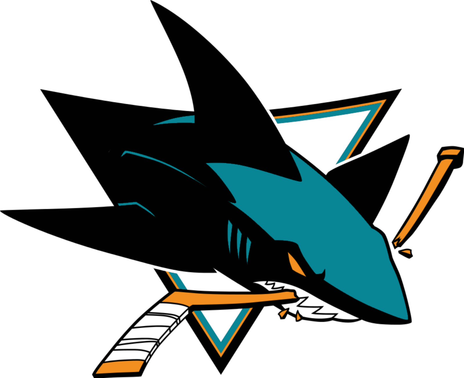
- The updates only made the logo more professional and refined without touching the central visual metaphor – a shark crushing a hockey stick.
- The composition of the logo remained unchanged after its first redesign in 2013, though with the appearance of the new color in the visual identity palette, it became more powerful and energetic.
- 1991 — 2013 The original version I the San Jose Sharks logo was introduced by Terry Smith Creations in 1991 and stayed unchanged for more than twenty years.
- The composition of the visual identity featured a black shark with a broken hockey stick between its tech.
- The image was placed in a triangular frame, pointing down, with the shark’s contours coming out of the geometric outline to the right, creating a sense of movement and dynamics.
- 2013 — Today In 2013 the logo was redesigned by Terry Smith, redrawing the shark’s contour and switching its color palette from plain black to the dark turquoise and black mix.
- The shark itself became more futuristic and “mechanic”, looking dangerous with its orange severe eyes.
- The additional logo versions of San Jose Sharks include an orange and blue rhombus with a black shark fin (this icon replaced the circular one from 2001), the full emblem with a bold sea-blue inscription placed diagonally under the shark, and a version with gradient shades, where all the components remain the same as on the primary logo.
- 2016 — Today There is also a second line of the emblems for the team, created by Terry Smith in 2016.
- The animal can be used on its own, or with a bold stylized “SJ” monogram in outlines italicized sans-serif.
- The light orange hockey stick of the earliest logo was replaced by a more saturated shade of orange.
- Now, teal started to play a more prominent role: it appeared not only as part of the triangle but was also the color of the top of the shark’s body.
- The shade of teal is pretty similar to the Pantone 3155 C color, while the shade of orange resembles Pantone 152 C orange.









Leave a Review