San Jose Earthquakes logo and symbol, meaning, history, PNG
- Download PNG San Jose Earthquakes Logo PNG San Jose Earthquakes is the name of a football club, which was established in 1994 in California, USA.
- Today it is a pretty successful club of Major League Soccer.
- 1995 — 1999 The logo for the San Jose Clash club was designed in 1995 and stayed with them until 2000 when the name was changed.
- The wordmark was placed between the claws, in the bottom part of the emblem.
- The “Clash” part was written in a neon-banner style, italicized yet strong and geometric.
- The “San Jose” inscription in all capitals was written under it in yellow color, executed in a thin sans-serif.
- It was a trian-gular crest executed in blue and gray, with an enlarged monochrome football placed on its bottom part.
- The “San Jose” lettering was written in white on a black ribbon above the crest, and the “Earthquakes” nameplate in massive hard-rock style letters was placed on the banner, crossing the bottom of the emblem.
- 2008 — 2013 The badge was redesigned in 2008, getting more volume, by using gradient shades on the football.
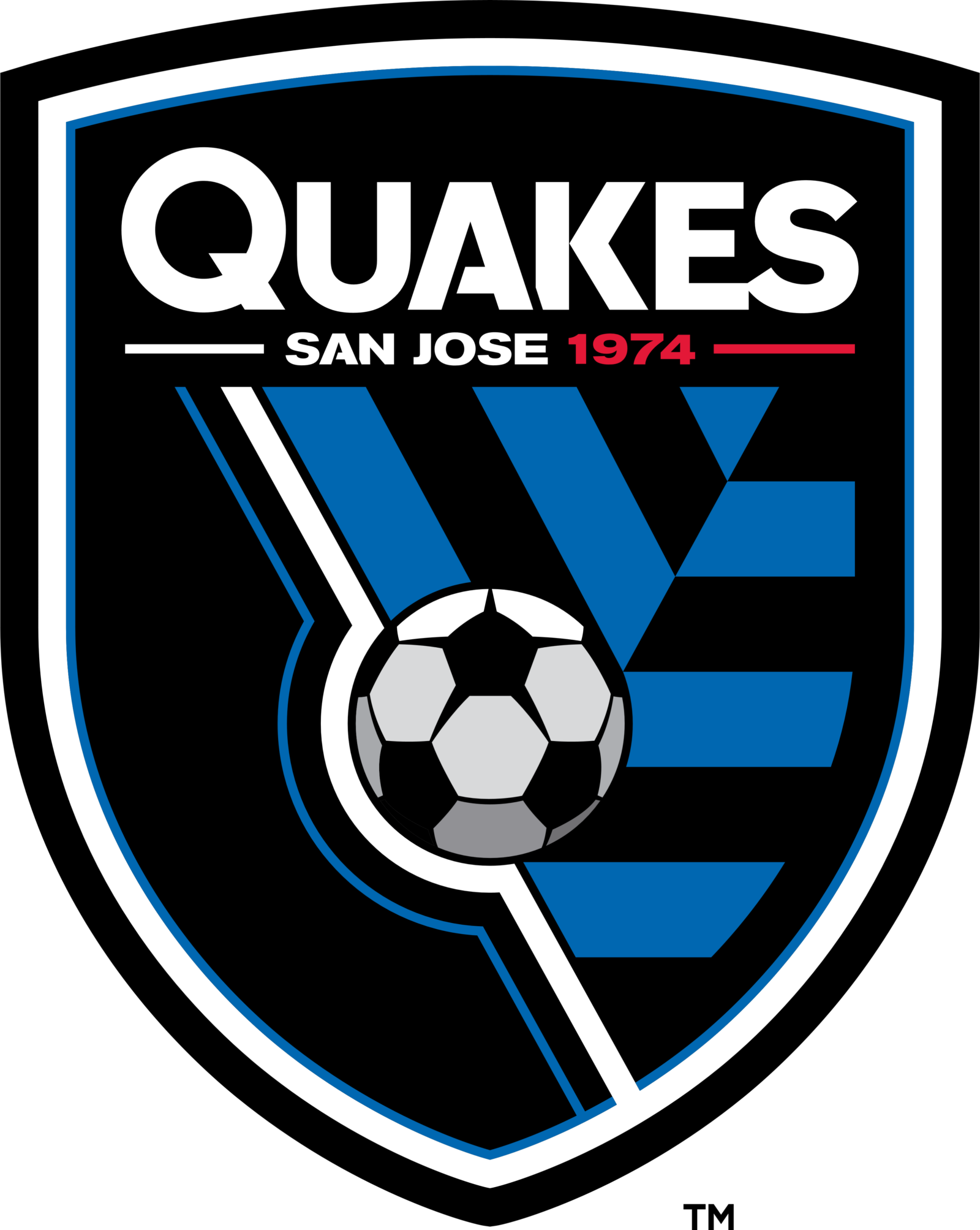
- 2014 — Today A completely new badge was created for the club in 2014, it is a smooth traditional crest with rounded sides.
- The main color of the emblem is black, and the accent and letters are colored white, blue, and red.
- A perfect combination to represent power, passion, and determination.
- The football is placed in the middle of the crest, with two diagonal lines, white and blue, crossing the emblem from the upper left corner to the bottom right.
- On the right of the ball, there is a blue and black geometric pattern, and the left part of the shield is plain black.










Leave a Review