San Jose Barracuda logo and symbol, meaning, history, PNG
- Download PNG San Jose Barracuda Logo PNG The American Hockey League team San Jose Barracuda is the former AHL club Worcester Sharks, which relocated to San Jose in 2015.
- It is an affiliate team of the NHL’s San Jose Sharks.
- Meaning and history 1996 — 2001 The logo of the club, created in 1996, featured the original name of the Barracuda, the Kentucky Thoroughblades.
- The badge featured a funny caricature of a horse with a horseshoe tattoo on its breast.
- The animal was wearing skates and held a hockey stick in its hands.
- It was a cool caricature of a gray shark with a hockey stick, drawn on a circular blue background, with a double black and yellow outline.
- The whole image looked very creative and funny.
- The sea-blue banner with the lettering was placed above the triangular emblem and featured a two-leveled inscription in black and white on it.
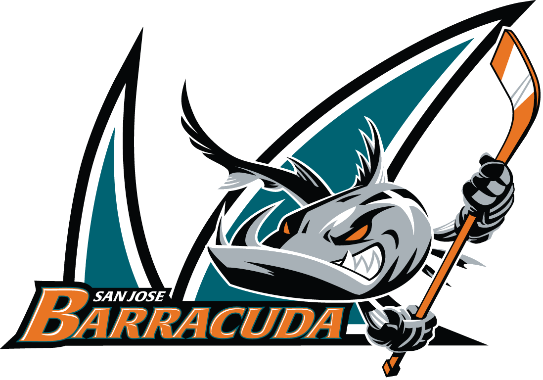
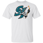
- 2015 — 2018 A ferocious anthropomorphized barracuda shark is the central theme of the San Jose Barracuda logo.
- The beast is clenching its “fingers” around a hockey stick.
- 2018 — Today The redesigns of 2018 kept the concept of the previous logo but simplified and cleaned the badge.
- The shark’s fins from the background became smaller, which made the gray barracuda the star of the logo.
- Colors Teal creates a soft and appealing combination with the comparatively discreet shade of orange, while black, white, and grey add refinement and diversity.
- Video






Leave a Review