San Diego Gulls logo and symbol, meaning, history, PNG
- Download PNG San Diego Gulls Logo PNG The American Hockey League team San Diego Gulls was created in 2015 on the basis of the Norfolk Admirals franchise, which had relocated from Norfolk, Virginia.
- Meaning and history 2000 — 2004 The original name of San Diogo Gull was Admirals, so the first two versions of the club’s logo were built around the wordmark with the original name.
- The logo, created in 2000, featured a navy blue circle in a yellow outline, with five five-pointed stars in two shades of yellow, and a diagonally located serif inscription.
- The lettering was executed in dark blue capitals, with the first letter enlarged and its horizontal bar replaced by a long yellow line, where the “Norfolk” in sans-serif uppercase letters was placed.
- 2004 — 2015 The logo was dramatically changed in 2004.
- It was a completely new mood and style — a scarlet-red circle in a black and yellow outline featured a sharp white sun-like element in it and an image of a massive black ship.
- Under the ship, the enlarged uppercase “Admirals” wordmark was written in a smooth and bold sans-serif typeface with arched full contours.
- The lettering was underlined by a black arch with five yellow stars on it.
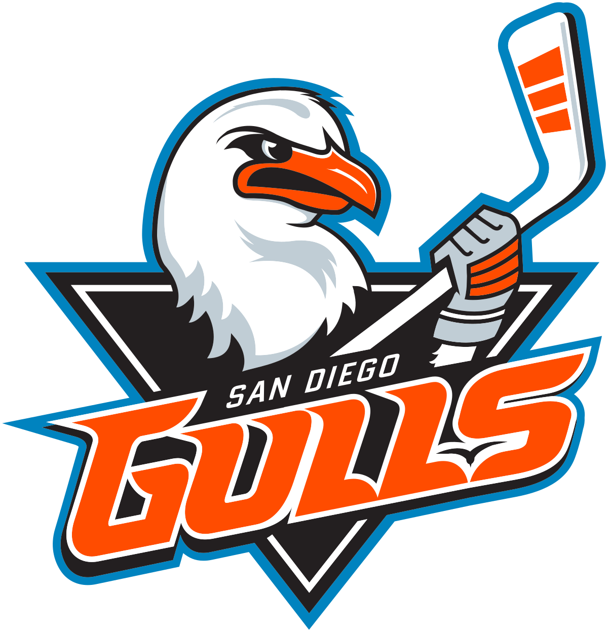
- 2015 — Today The San Diego Gulls logo and colors were unveiled during HockeyFest in the winter of 2015.
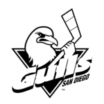
- The emblem featured the head of an anthropomorphized gull and also the gull’s paw, in which it was squeezing a hockey stick.
- The word “Gulls” in large letters paired with the smaller text “San Diego” was placed below.
- The design overlapped a black triangle.
- Colors The most eye-catching color of the palette is the vivid shade of orange used for the lettering and the gull’s beak.
- It creates a sharp contrast with the other colors, including black, white, silver, and blue.






Leave a Review