San Diego Clippers logo and symbol, meaning, history, PNG
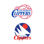
- Download PNG San Diego Clippers Logo PNG Meaning and history When the club moved to San Diego in 1979, it was renamed San Diego Clippers and, therefore, the need for a new logo arouse.
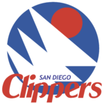
- Their first emblem was abstract and consisted of geometric shapes.
- There were three white overlapping triangles and a red circle above them.
- All these were placed inside a blue circle.
- 1978 — 1982 The initial emblem for the Clippers was created in 1978 and boasted an interesting modern composition with special geometry and an intense color palette.
- The solid blue circle had three white overlapping triangles placed on it diagonally and a smaller red circle, coming out of the white structure.
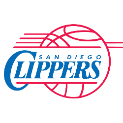
- 1982 — 1984 The redesign of 1982 kept the white, blue, and red color palette of the Clippers logo, but changed the composition.
- Now it was a contoured red basketball with three lines coming out to the left and two — to the right, as a sign of motion and speed.





Leave a Review