San Antonio Spurs logo and symbol, meaning, history, PNG
- Its earliest logo featured a light blue chaparral bird with an orange basketball.
- 1967 — 1970 The initial emblem for the club from San Antonio was created when the team was called Chaparrals.
- 1970 — 1973 The redesign of 1970 strengthened the line of the bird and a ball and placed it on the light gray state contour.
- 1973 — 1989 The name of the team was changed to San Antonio Spurs in 1973, and this is when the first version of the logo we all know today was introduced.
- It was a very delightful and memorable badge, with a great balance of playfulness, elegance, and power.
- 2002 — 2017 The colorful background was removed in 2002.
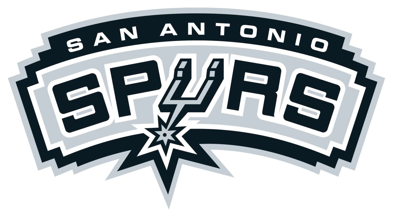
- Now the black and gray lettering is arched and placed on a light gray banner in a black frame.
- 2017 — Today In the 2017 version, the arched effect of the previous emblem, as well as the “spur” on the “U” remained as they were, while the typeface was customized.
- Today, the team uses the full wordmark as its global logo, while the status of the primary logo inside the country belongs to the stylized “U”.
- Alternative symbol In addition to the primary emblems, the Spurs also have a secondary logo, which can often be seen on the brand’s merchandise.
- However, the club’s wordmark features a different typeface.
- One of the distinctive features of the custom type is the diamond-shaped angles on the S, O, P, R, while the N, A, and T look very much like the corresponding glyphs from the Helvetica Bold font.
- Color Black (PMS Black) and silver (PMS 877) are the team’s official colors.
- Both of them are featured on the San Antonio Spurs logo against the white background.


Leave a Review