Russian Premier League logo and symbol, meaning, history, PNG
- Download PNG Russian Premier League Logo PNG Meaning and history 2006 — 2011 The Russian Premier League badge, created in 2006, was based on the heraldic symbols and the visual identity of the main league’s sponsor, Rosgosstrah, one of the leading and largest insurance companies in Russia.
- The upper part of the crest boasted a white and gold composition with a smaller crest having two eagles heads on top and two elongated spread to the sides wings.
- Between the heads of the eagles, there was a red and gold crown, which balanced the color palette of the smaller crest, with the sponsor’s monogram on it.
- The main part of the logo was embedded with the red and white image of the football ball, white lettering arched under it, and a white banner with gold lettering, where the Rosgossrah logotype was written.
- 2011 — 2014 An old Russian Premier League logo featured a blue star in the form of a football player who is just about to kick a football.
- 2014 — 2015 The redesign of 2014 refined the Russian Premier League badge, keeping the blue, white, and red color palette, but redrawing the logo, making it glossy and vivid.
- The upper part of the medallion boasted gradient blue and white football ball pattern, while the bottom part was taken by a bright red badge with the “Russian Championship” lettering in all capitals of a modern sans-serif typeface.
- 2015 — 2018 With the change of the main sponsor, the logo was redesigned again in 2015.
- As Rosgosstrah came back to the league, their original red white, and goldcrest also returned, being redrawn in a simplified two-dimensional manner with no gradients and extra framing.
- Now the smaller crest under the eagles’ heads featured a white stylized “1921” datemark, while the placement and style of all other elements remained almost exactly the same as on the initial version, introduced in 2006.
- 2018 — Today In advance of the 2018–19 season, Art.
- Lebedev Studio developed a new brand identity.
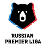
- Here, one of the country’s most known symbols, a bear, is featured.
- The colors of the Russian flag, red, white, and blue, are clearly seen on the logo.









Leave a Review