RuneScape Logo and symbol, meaning, history, PNG
- Download PNG RuneScape Logo PNG RuneScape is the name of a popular MMORPG, which was launched in 2001 and has its versions available for almost all operating systems, including iOS and Android.
- RuneScape is considered to be the largest game of this kind and has its place in the Guinness Records list.
- 1998 — 2001 The very first logo for the MMORPG was designed in 1998 and featured a very simple and modest Badgers which stayed untouched for three years, until the acquisition of the game by Jagex.
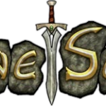
- 2001 — 2008 After the game got a new owner and name, its logo was redesigned.
- The new concept was built around runes.
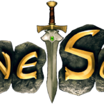
- Each letter of the nameplate was located on a separate gray stone, and the two words were separated by a diagonally placed sword with a golden handle.
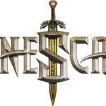
- 2008 — 2011 The logo was refreshed in 2008, keeping the original concept, but getting all the elements redrawn.
- Now the runes got brown shade and got placed in one line with the sword as a separating element again, but this time located vertically and pointing down.
- The letters were also changed to bolder and sharper ones and the black color was replaced by voluminous and slightly gradient gold.
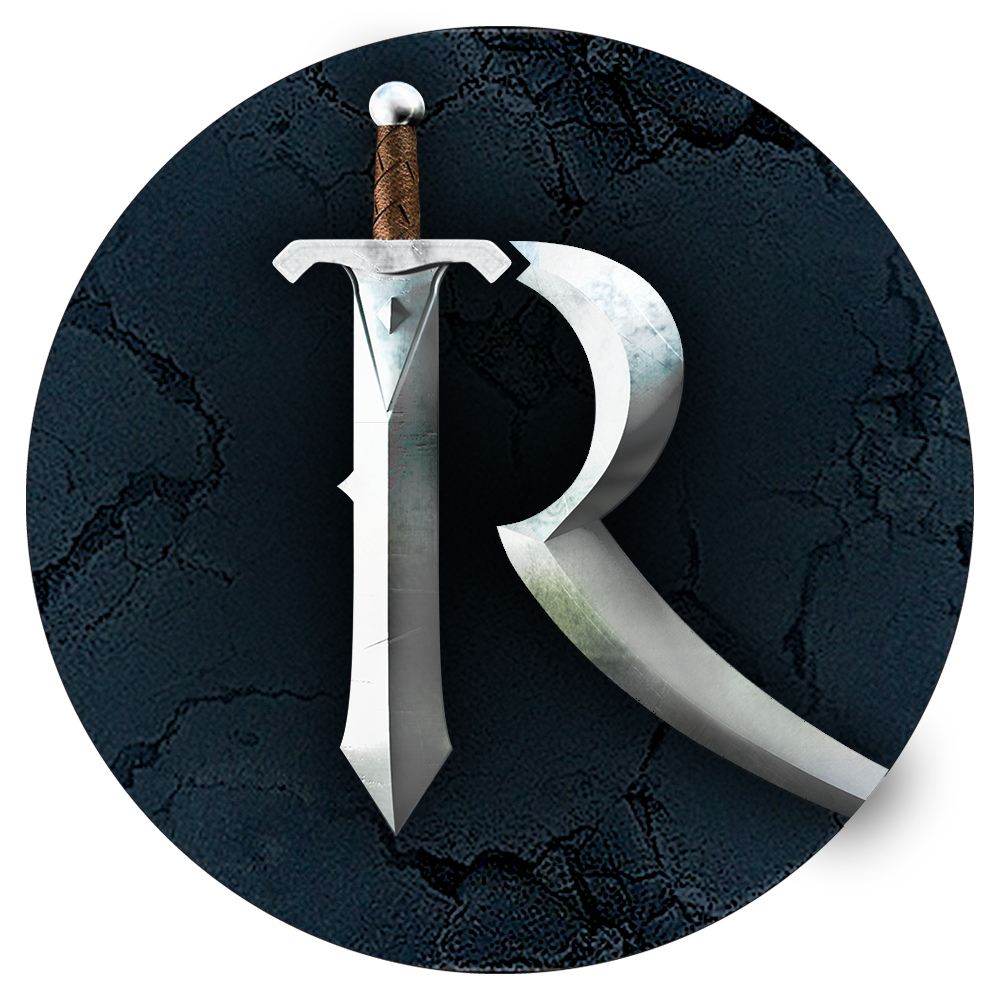
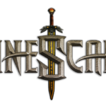
- 2013 — Today In 2013 the RuneScape visual identity gets redesigned again.
- Now the sword became a part of the lettering, being integrated as a vertical bar in the first letter, “R”.
- The tail of the “R” had been elongated and curved, forming a line, resembling the infinity sign.
- Another significant change was done to the color palette of the logo.
- The new scheme is based on light solver and orange, creating a pattern of metal and fire, cold and hot.




Leave a Review