Round Rock Express logo and symbol, meaning, history, PNG
- Download PNG Round Rock Express Logo PNG The team started its history in 1979 as Ogden A’s.
- After more than two decades spent under the name of Edmonton Trappers, the team eventually relocated to Round Rock, Texas, in 2005 and adopted its current name.
- By the way, it was inspired by the senior Ryan’s pitcher nickname, “The Ryan Express.” Meaning and history 2005 — 2010 The baseball team Round Rock Express competing in the Pacific Coast League has a logo inspired by the “train” theme, which perfectly fits its name.
- The original Round Rock Express logo featured the arched lettering “Express” in red with a railroad track (navy blue, grey) going around it.
- The text “Round Rock” can be seen above.
- 2011 — 2018 When the team was upgraded from Double-A to Triple-A and became an affiliate of the Texas Rangers in 2011, the brand identity was modified, too.
- The primary emblem developed by Louisville, KY-based Studio Simon placed the team’s name on the front part of a train.
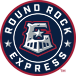
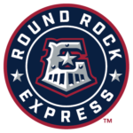
- 2019 — Today The Round Rock Express logo, created for the club in 2019, is based on the previous version, but in a more stylish and modern interpretation.
- This time the logo is circular, with the sharp train grille as the part of the letter “E”, placed in the very center of the badge.
- The “E” is placed on a dark blue background and has a double circular white and red framing.
- The white uppercase lettering is placed around the perimeter of the badge, with the two parts of the inscription separated by two white and gray five-pointed stars.
- Colors The palette is based heavily on that of the Texas Rangers logo.
- Similar to the parent team’s emblem, the Round Rock Express logo features blue, red, and white.
- However, due to the addition of silver, their logo looks a bit softer and more subdued than the Ranger’s emblem.





Leave a Review