Rose Bowl Logo
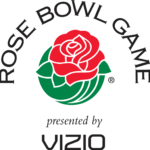
- Download PNG Rose Bowl Logo PNG While the Rose Bowl logo has undergone several modifications since 1999, it has preserved its core symbol, the rose flower.
- Meaning and history 1999 – 2002 The logo, created for the Rose Bowl in 1999 only stayed for less than three years.
- It was the iconic green and red rose, with the black arched inscription above it and a bold black tagline.
- The tagline was saying “Presented by AT&T” and used two different styles for its two lines.
- 2004 – 2010 In 2004 the sponsorship changed, so did the tagline.
- Now the “AT&T” in bold black capitals was replaced by the blue and red Citibank logo, with its iconic typeface and delicate geometry.
- The green and red rose emblem and the black serif wordmark above it remained untouched.
- 2010 – 2013 The Citibank logotype was replaced by the Vizio insignia in 2010.
- Due to the new badge under the main emblem, the logo started looking more balanced, as the modern custom Vizio logotype also used black color as it’s main and only.
- The middle part of the rectangle was stretched horizontally, featured a white background and the bold black uppercase “Rose Bowl Game” inscription on it.
- The name of the bowl game is arched above.
- In most of the logotypes, the wordmark has looked virtually the same, either with subtle differences or without any differences at all.
- The 2014 emblem, however, had a different structure, although the rose was preserved.
- Font and color The main wordmark from the Rose Bowl Logo is arched above the emblem in all capitals and executed in a very elegant serif typeface, which looks very similar to iconic Copperplate EF Medium, with thick vertical lines and thin elongated and sharpened serifs.


Leave a Review