Roma logo and symbol, meaning, history, PNG
- For instance, the wolf theme and the shield shape, both of which have been present in the majority of the logotypes the football club has had so far.
- They couldn’t agree, though, how to call it, so they started fighting and fought so savagely that Romulus eventually killed his brother.
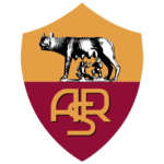
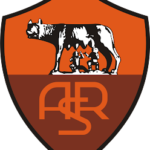
- 1927 – 1930 The very first football club logo, which was adopted in 1927, comprised the depiction of the statue with the monogram “ASR” (Associazione Sportiva Roma) below.
- The symbol was placed inside a shield shape.
- The legendary Roma symbol made a return, though, in 1934.
- Back were the shield shape and the wolf.
- The upper part of the crest featured a soft beige gold background, with the wolf drawn over it in black lines.
- 1945 – 1949 In 1945, the club returned to the monogram logo, although it now looked differently – the interlacing letters were surrounded with a shield shape divided into two fields, red and yellow.
- 1949 – 1950s The yellow and red “ASR” crest emblem turned into a circular medallion in 1949.
- 1960s Two new badges were created for the Roma football club in the 1960s.
- Both were based on the classy crest from 1934, but with some differences.
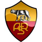
- The first one featured a more intense color palette, with deep yellow and burgundy shades and a large yellow monogram on the bottom part.
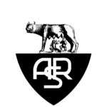
- As for the second logo, it was more elegant and strict, in a bold black outline, with a two-leveled inscription in white and black.
- 1960s – 1970s The next Roma badge, created in the 1960s, featured a darker color palette and larger size of the black elements, which made the overall mood of the visual identity more solid, confident, and even dangerous.
- The wolf was enlarged and drawn in black and brown shades, while the monogram under it was written in small letters, using dark gold shade, which was almost invisible on a burgundy background.
- 1979 – 1997 A completely different logo was used by the Italian football club in the 1980s.
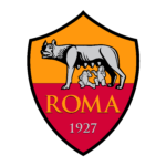
- 1997 – 2000 In 1997 the club decides to come back to its roots and starts using the classy two-colored crest as the official logo again.
- 2013 – 2016 The redesign of 2013 made the Roma logo look smoother due to the use of gray shade for the elements that were colored white on the previous badge.
- Font The sans serif font featured on the Roma logo has a traditional feel.
- It may look even old-fashioned, yet, taking into consideration the overall style of the logo and the way it emphasizes the history of the club, this choice doesn’t seem out of place at all.




Leave a Review