evolution history and meaning, PNG
- Download PNG Rodarte Logo PNG The type featured in the logo of the Californian label Rodarte reveals its beauty the moment you take a closer look at it.
- Meaning and history The very first collection sisters Kate and Laura Mulleavy created appeared in a February 2005 issue of Women’s Wear Daily.
- The collection, which consisted of only ten pieces, caught the eye of Vogue editor-in-chief Anna Wintour.
- She flew to Los Angeles to meet the sisters.
- Since then, the brand has received many fashion industry awards.
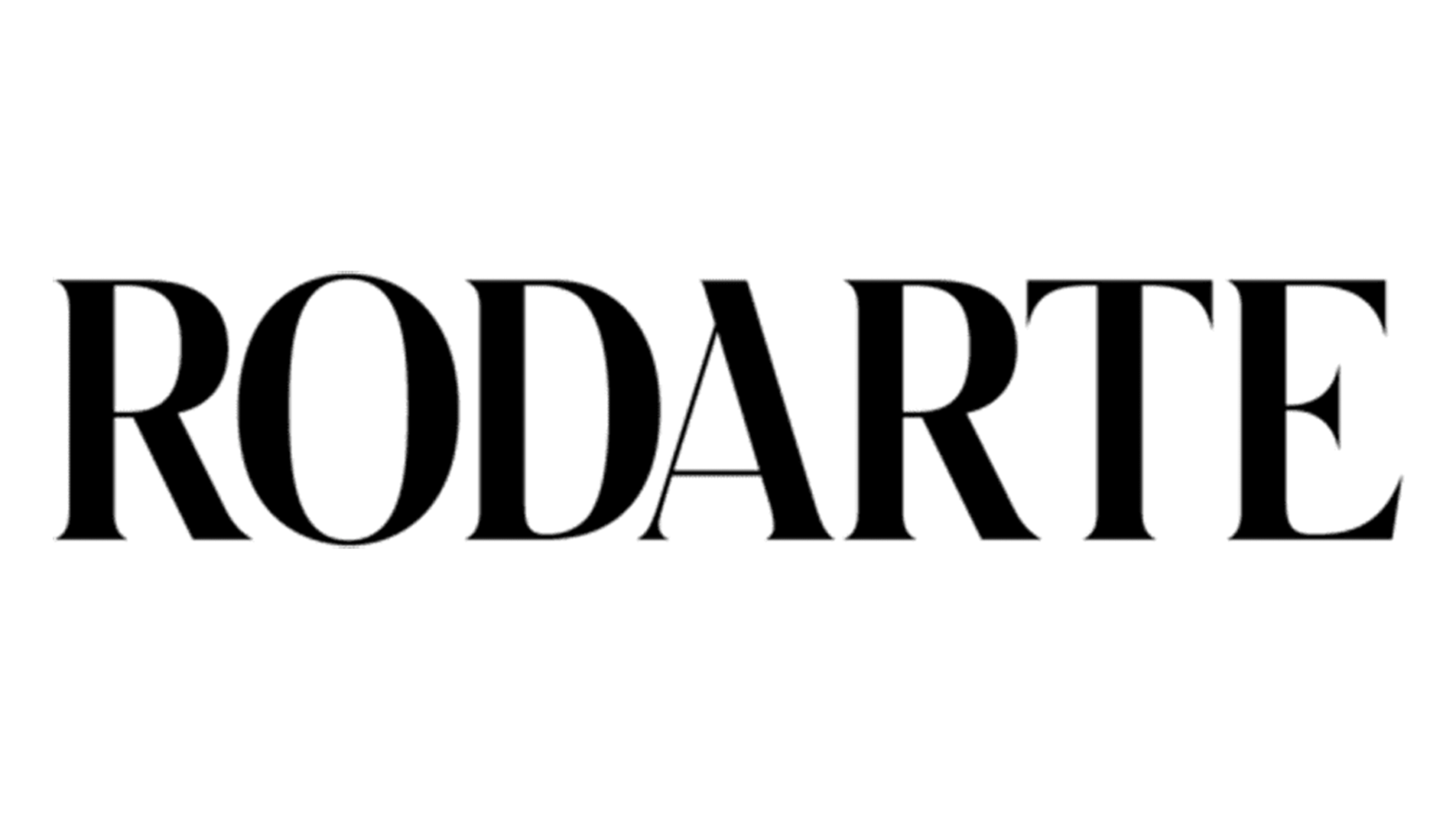
- Wordmark The Rodarte logo showcases the name of the brand in gray or black on the white background.
- There are no pictorial elements, symbols or emblems of any kind – nothing but the wordmark.
- For the authors of the design, this is quite a challenge as they need to convey the brand’s essence with very limited means.
- How was this objective reached in this case?
- The design forces behind the logo focused on making the typography striking and unique.
- In a way, the typeface has absorbed the brand’s style, which has been described as “strange,” “risky,” “deconstructed,” and yet still wearable (this was translated to “legible” in the case of the type).
- The width of the strokes varies dramatically within every glyph, due to which the type adopts its classic calligraphic quality.
- The serifs are exceptionally thin, they are on the verge of visibility, like high, thin stilettos – although they are almost invisible, they transform the whole look.
- Also, some of the glyphs in the Rodarte logo have unusual details (the diagonal bars of the “A,” for instance).






Leave a Review