Rochester Red Wings logo and symbol, meaning, history, PNG
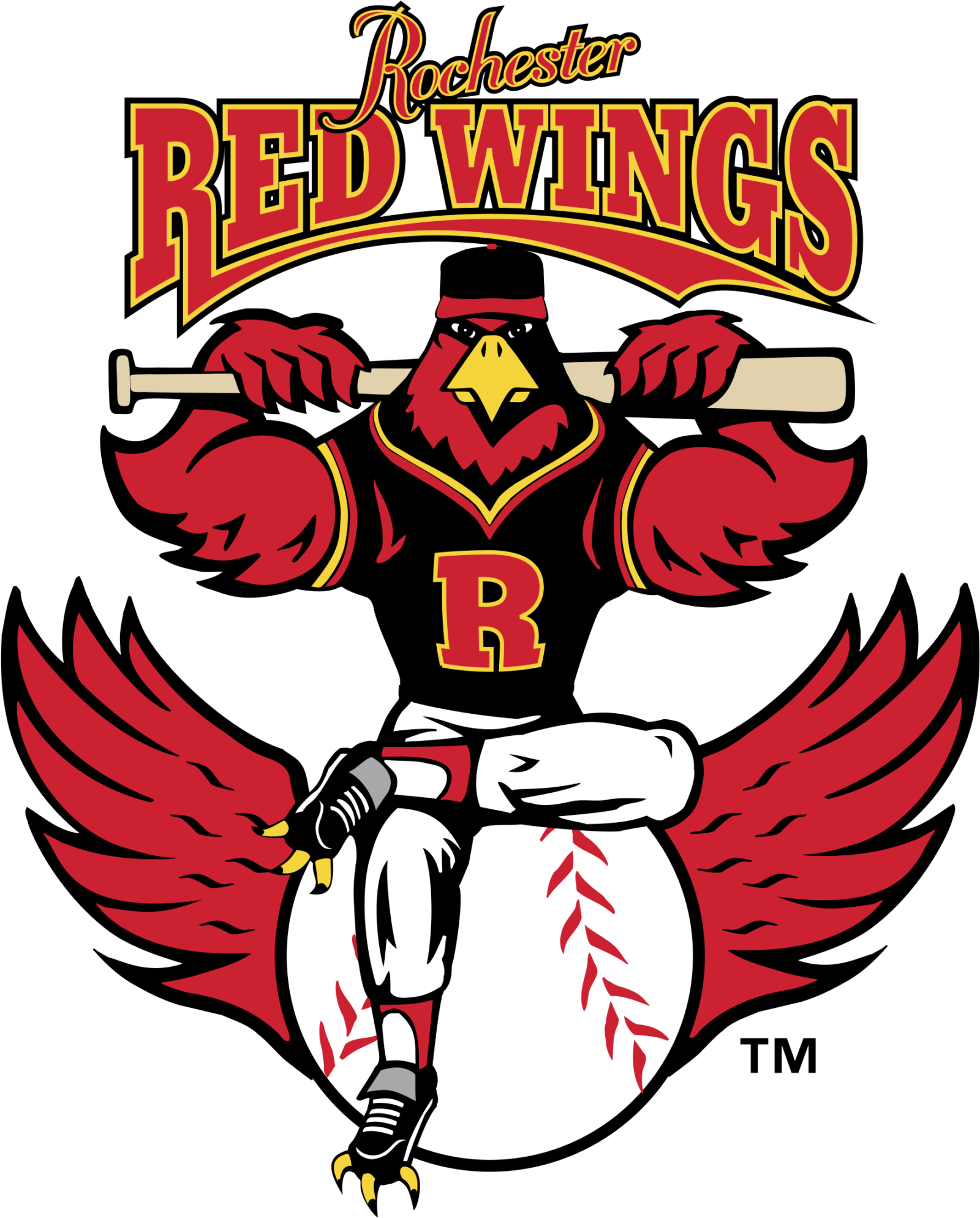
- Meaning and history While old emblems of the Minor League Baseball team Rochester Red Wings featured some abstract red wings, in recent logos, the wings, have been just part of the team’s bird mascot.
- 1981 — 1994 The Rochester Red Wings logo introduced in 1981 featured a flying baseball with the team’s name on the forefront.
- 1995 — 1996 In the following version, which was adopted in 1995, the ball seemed to be static, but it had a pair of red wings, one from each side.
- The name of the team was replaced by a script “R” in red.
- 1997 — 2013 Only two years later, the team unveiled an entirely new brand identity.
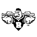
- It featured a red bird, who actually was team mascot called Spikes.
- The same attitude is preserved on the cap insignia and alternative emblems.
- Colors The color scheme is a balanced combination of black, red, white, and gold.






Leave a Review