Rochester Americans logo and symbol, meaning, history, PNG
- Download PNG Rochester Americans logo PNG As an ice hockey team with a more than half a century history, the Rochester Americans have gone through several logos.
- Meaning and history 1956 — 1957 The original Rochester Americans logo, which was introduced in advance of the 1956/57 playing season, featured a large red “R” with the word “Americans” in smaller letters placed over it.
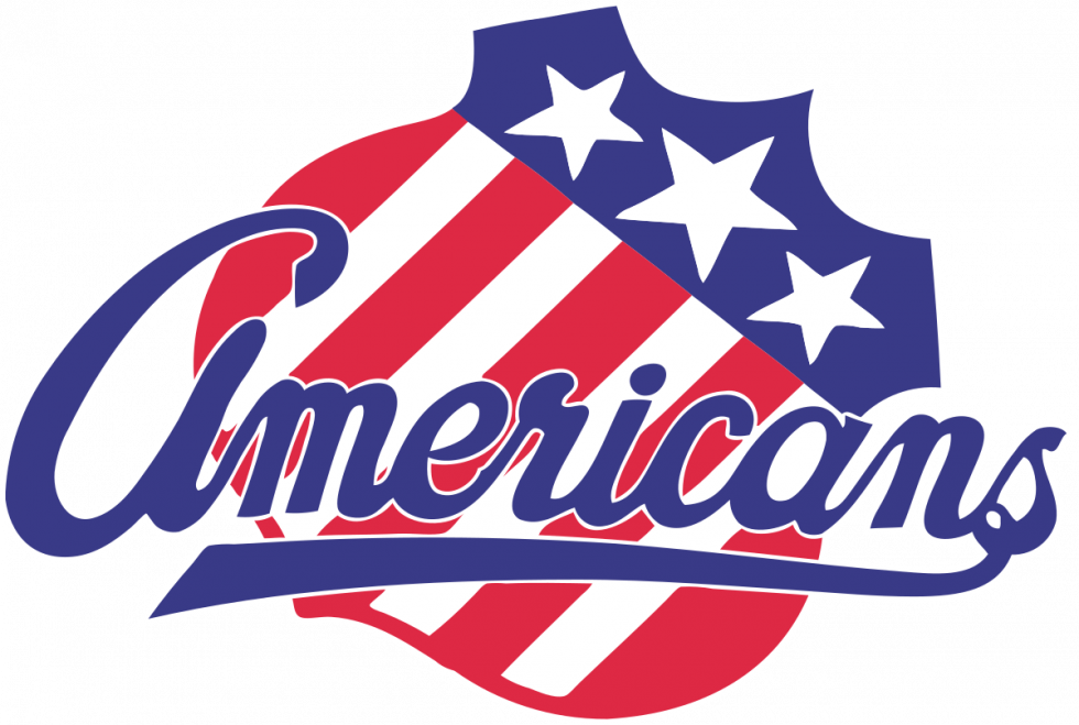
- 1957 — 1969 Only three years later, the team adopted an emblem that looked like a shield shape cut out of the American flag.
- The shield was rotated diagonally.
- 1969 — 1972 After using an emblem looking like a red mountain in a circle for one playing season in 1971/72, the team returned to its American flag shield.
- 1972 — Today Now, the crest was rotated at a different angle and had the team’s name written across it.
- It was slightly updated two times.
- Video







Leave a Review