Contents
Roanoke Rail Yard Dawgs logo and symbol, meaning, history, PNG
- Its logo unveiled in 2014 says a lot about the local history.
- Founded in 2009 as the Mississippi Surge and renamed in 2013, the Rail Yard Dawgs represent the Roanoke Valley in the professional ice hockey.
- Meaning and history 2009 — 2011 The original name of the club we all know today as the Roanoke Rail Yard Dawgs was Mississippi Surge.
- 2011 — 2013 The redesign of 2011 kept the color palette and the main idea of the Mississippi Surge visual identity but has redrawn it, placing all elements into and on the blue, gray, and white circular badge in a thick framing.
- The full wordmark was now written in yellow around the perimeter of the badge, while the central part was given to the stylized yellow and blue “S” in a gray outline.
- It was a dark blue and calm yellow crest-like emblem with three lighting bolts drawn on its upper part, the enlarged gradient yellow “Surge” inscription along the bottom half of the crest, and a thin yet masculine white “Mississippi” lettering arched along the upper border of the badge, in all capitals of a clean geometric font.
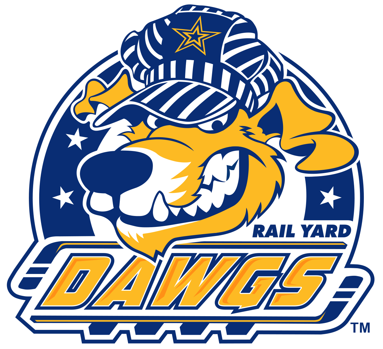
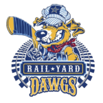
- Roanoke has been a railroad hub for a long time, and the Roanoke Rail Yard Dawgs logo depicts this rail history with the help of railroad tracks.
- They encircle Diesel, the team’s mascot.
- His apparel is similar to the apparel train conductors used to wear.
- There is the Mill Mountain Star on his hat.
- The Star is considered to be the most iconic landmark in Roanoke.
- He is holding a stick to show that he represents an ice hockey team.
- The team name and the name of the city are at the bottom of the logo.
- The colors used in the Roanoke Rail Yard Dawgs logo are Royal blue, powder blue, gold and red.





Leave a Review